
CSS Image Effects #3: Vignettes 3 Ways
Published on
This is part of a series of posts breaking down visual effects using CSS filters and blend modes. Read Part 1: The Vintage Washout Effect and Part 2: 3d Glasses for some background on blend modes. In this post we’ll explore one of the most popular photo filters: the vignette. A vignette fades an image around the corners to draw attention to the center. There are a few ways to get this effect with CSS.
Method 1: Inset Box Shadow
The first and most widely supported method is to use an inset box-shadow on an element. box-shadow is actually a very interesting and flexible property. I even wrote an entire post on how to made pixel art out of box shadows using Sass lists and functions.
The way it works is generally like this 1: box-shadow: [horizontal offset] [vertical offset] [blur radius] [optional spread radius] [color];
Here is an editable example of a pretty standard usage of box shadow:
But `box-shadow` also has an *inset* property which reverses the direction of the spread. Instead of starting *outside* of the div, the shadow begins at its perimiters and works its way toward the center. If we take the exact same code as above but add the `inset` keyword, it looks like this:
So we can center that shadow by giving it a value of `0` for its vertical and horizontal offset, and extending the shadow to spread over a wider range:
So basically with one line of code we can add a vignette to our images! Now there’s one catch about this — when applying box-shadow the browser renders the shadow behind the content (makes sense..) but because <img> is content, applying an inset shadow to it won’t let us see the shadow at all. Thus you’d need to use pseudo elements or layer divs:
/* removing shadow on hover for demonstration purposes */ .vignette-inset:hover:after { box-shadow: none; }
So I think this works okay and all, but it makes a kind of awkwardly visible square around the perimeter. Also, it’s not what a real vignette looks like (which is round because of the roundness of the lens filter). But there are luckily solutions!
Method 2: Radial Gradients
A basic radial gradient background, from transparent (rgba(0,0,0,0)) to black (rgba(0,0,0,1)) looks like this applied on top of a hotpink base:
Now, that darkens the image a lot more than we’d like it to. This is because there is a perfect blend of the transparent color (at the 0% stop) to the black color (at the 100% stop). So to solve for this, and make our background image more visible, we can have the transparent part of the gradient start its blend at a further stop. By using radial-gradient(transparent 50%, black), the gradient is transparent up to 50%, at which point it begins to blend into the next shade and stop (black at 100%).
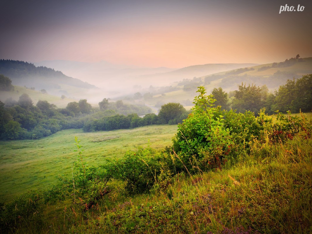
The Lens Effect
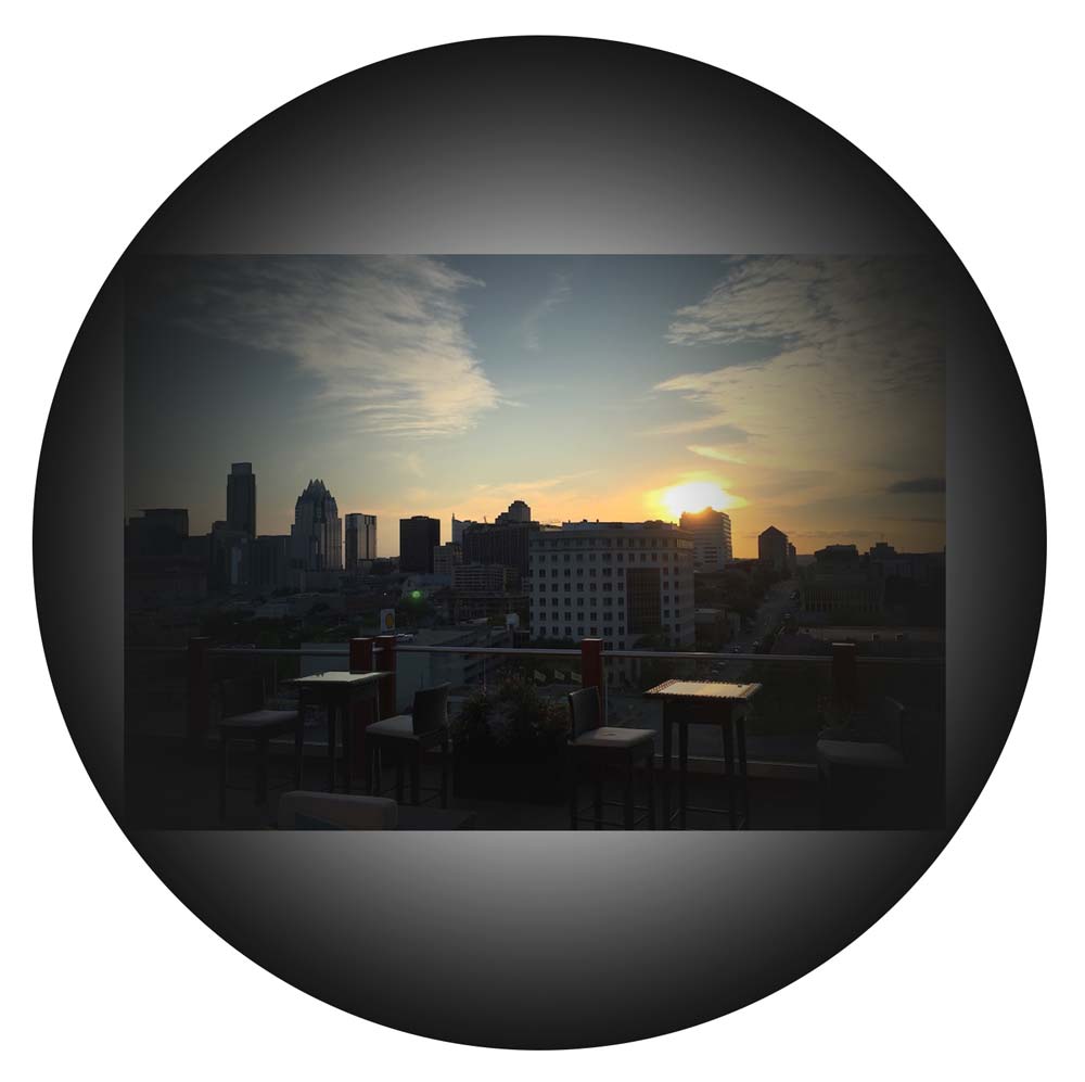
Now, this is getting a little closer, but it’s not what a “real” vignette looks like. If we think about vignettes in photography, the lens is creating a darkening around the image, like this:
So to solve this, we can first change the shape of our gradient ellipse to mimic a lens and be a perfect circle from the center of the image. This is done really easily with simply denoting the shape as circle in front of the gradient declaration. The next thing we’ll want to do is extend the spread of the dark color to outside of the border of the image. Those two things together look like this:
Using gradients in this was is also an excellent technique for making text more legible on top of images. You can use transparent-to-black gradients on light images which cover over areas of text (such as if there was text on the bottom of an image area), and the inverse on dark images. There's an excellent [CSS Tricks](https://css-tricks.com/design-considerations-text-images/) article on this, and other techniques.
Anyway, here’s a live example to play with if you’re into that sort of thing:
/* removing shadow on hover for demonstration purposes */ .vignette-radial:hover:after { background: none; }
Method 3: Blended Gradients
Now, who said gradients had to be all black and white? (don’t answer that). We can get a bit more creative with them using some color and blend modes! Let use the shaping techique from part 2 along with some color (instead of black) and introduce a blend mode to layer the gradient on top of the image.
In particular, the diference or exclusion blend modes provide some pretty neat effects when used in this way. These two blend modes are both comparative blend modes, and essentially take the overlapping pixels and subtract them from each other on a per-channel basis to find their difference (no pun intended).
They were originally used for lining up documents. When the document was perfectly black (in the case of difference) or at a 50% grey (in case of exclusion) they were exactly aligned. As briefly mentioned, the only difference is that in the difference blend mode, identical pixels cancel out to black whereas for exclusion, they cancel out to 50% grey.
But when pixels are different colors, they create vivid differences, and therefore when used subtly, create bright light effects. The following example uses a red gradient and the difference blend mode. You can layer multiple gradients for a more dramatic effect.
/* removing shadow on hover for demonstration purposes */ .vignette-colorful:hover:after { background: none; }
tl;dr: Vignettes are easy to implement and more realistic with gradients than box shadows. Colors are always fun, too.
{% include css-effects.html %}