
CSS Image Effects #2: 3D Glasses
Published on
This is part of a series of posts breaking down visual effects using CSS filters and blend modes. Read Part 1: The Vintage Washout Effect for some background on the lighten blend mode and to learn how to make a nice faded photo effect. In this post, we’ll look at how to recreate the 3D photo effect from films like Spy Kids 3D! (I don’t know why that’s the first thing that comes to mind, but deal with it).
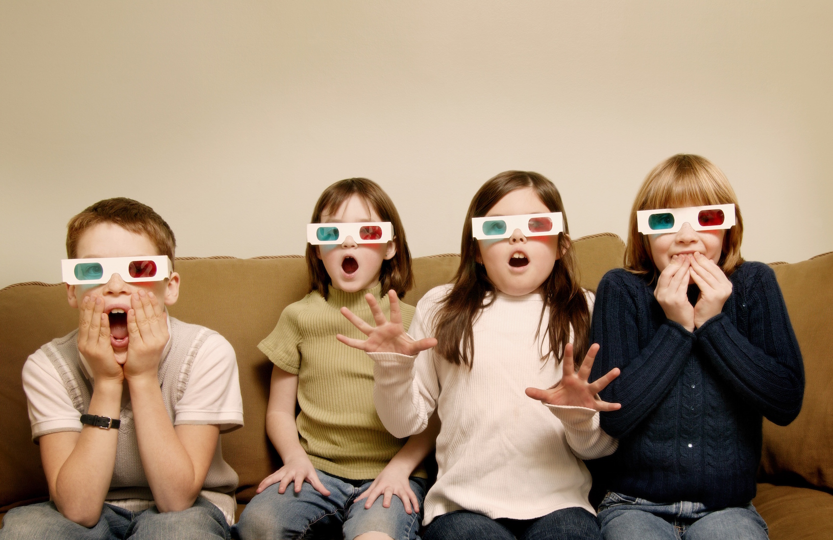
3D Images: AKA Anaglyphs #
An anaglyph is a type of stereo 3D image created from two photographs taken approximately 2.5 inches apart, the approximate distance between human eyes.1 This creates an illusion of depth when paired with colored lenses that swap the displaced tones. (It also means some people see 3D images in movies “better” than others depending on their pupilary distance.)
The Dark Side #
Back to blend modes. In the last post in this series, I took a look at the lighten blend mode. In this post, we’ll take a look at its evil twin — the darken blend mode.
Okay, why do I call it the evil twin? Mostly because puns, but let’s take a look at what’s going on here. Note: the blend mode is only applied to the top color block:
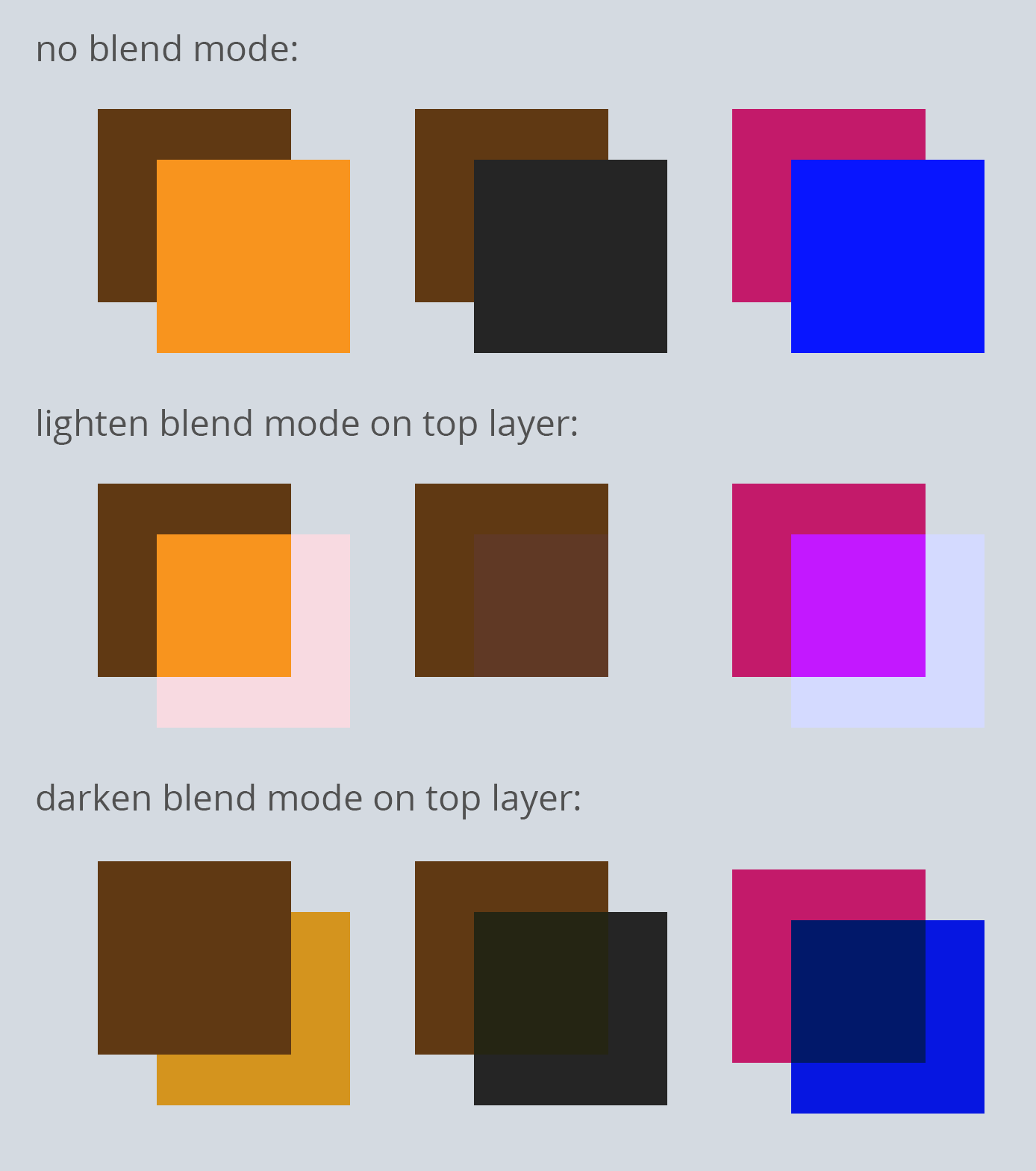
I added a grey background this time to better visualize the lightened item.
But the interesting question to ask is: what happens when you apply a lighten blend mode on top of a darken blend mode? They intersect and cancel out! This is also true with multiply / screen and color-burn / color-dodge because the way that the math is applied to each is an inverse of the other.
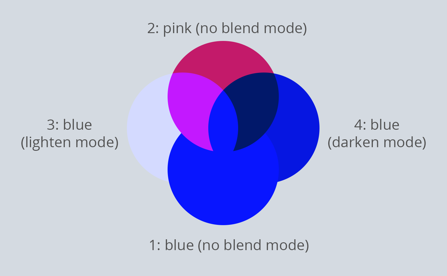
In this visualization, the numbers correspond with layer order. You can see that when the blue circle in lighten mode and the blue circle in darken mode intersect, they cancel out to return to their original blue color as though there were no blend modes applied at all.
3D Images #
We can use a bit of intersection to show the original image, and combine it with what we learned last week about how to determine shadow colors and create a 3D effect!
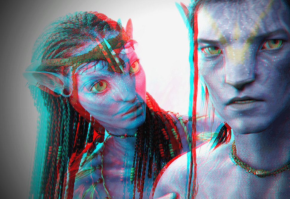
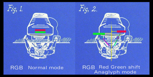
If you look at these images, there is a red layer, a cyan layer, and they are separated on either side of the original image by a certain distance value to simulate the 2.5 inch gap between eyes (we will use $dist for this value in the example @mixin below). So the steps for this are to use cyan and red as multiply backgrounds and blend those background with background-blend-mode: lighten to convert the dark tones to the respective colors. Then, we will position these elements a set distance apart from each other and add a perspective afterward.
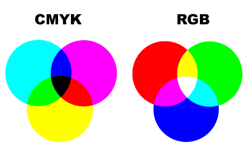
Now it’s not quiet that simple with selecting colors for this — but we are in luck. Keep in mind that we’re working in the RGB color space. If we used a cyan and yellow instead of the cyan and red, the overlap would be green instead of the white we need to then show the original pixel value. The values that will mix best in this situation are pure RGB values like red rgb(255, 0, 0), green rgb(0, 255, 0), and blue rgb(0, 0, 255), but cyan rgb(0,255,255) also works.
Note: sometimes people use green and red instead of blue and red for this effect anyway.
Blending the Blend Modes #
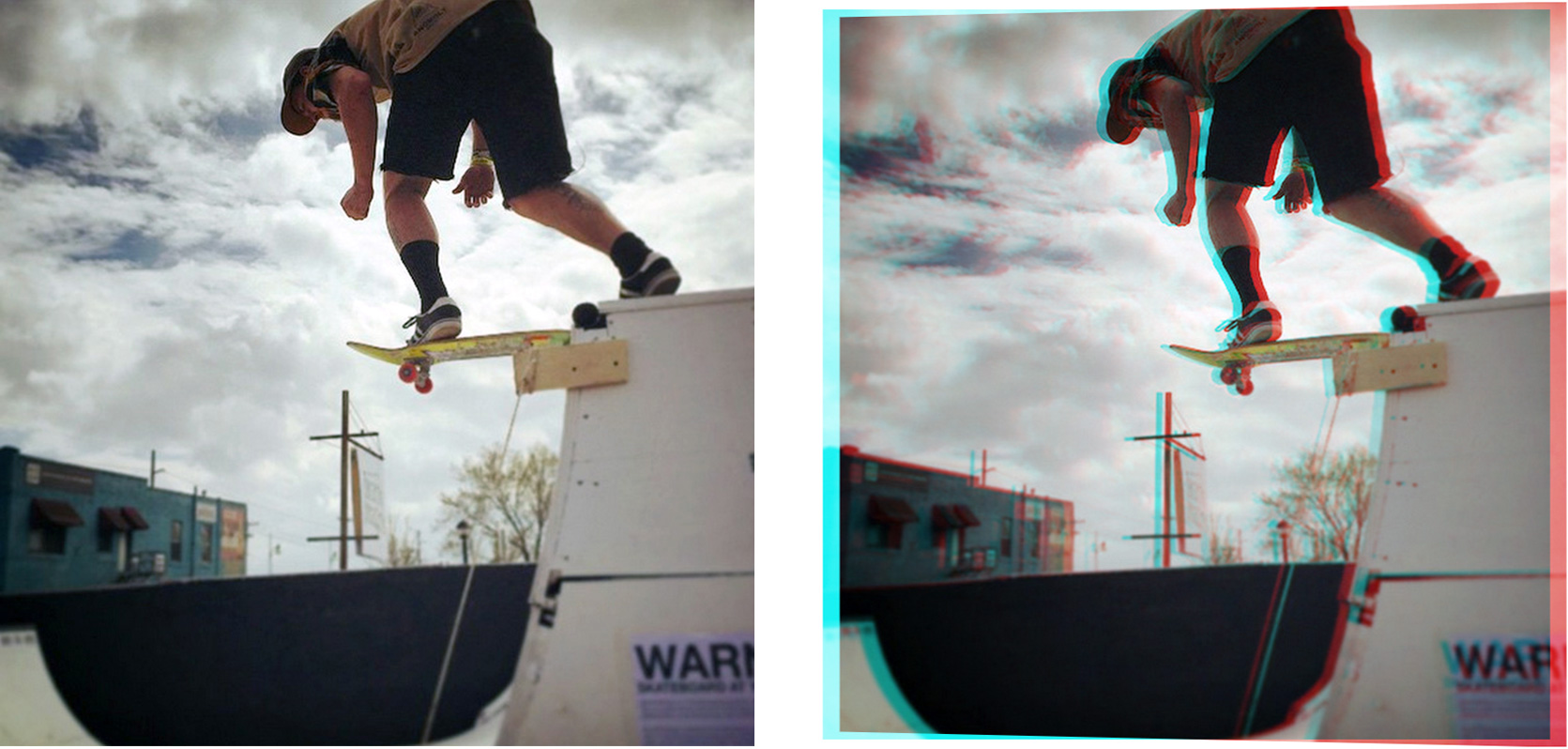
So lets use cyan and red because that’s what the classic 3D image effect applies. At this point it looks like this (with an additional outline added for clarity):
See the Pen 3D Effect 1 by Una Kravets (@una) on CodePen.
This is where the magic of blend mode math comes in! Now we simply apply a darken blend mode to the top layer (the red) so that it cancels out with the lower layer (cyan) at areas in which is it overlapping the same pixel values! That means that the spread distance will show the respective colors (cyan and red) on either side since the pixels do not align exactly. This should explain with a visual animation:
See the Pen 3D Effect Part 2 by Una Kravets (@una) on CodePen.
Perspective #
The next step is perspective. We can use the perspective and transform: rotateY properties to get the illusion outlined in the first figure where each image is inverting from each side. So on the cyan bit, it is: perspective: 400px; transform: rotateY(5deg); (400px being the width of the image) and on the red part, I have halved the rotation angle since it is inheriting from its parent, so it is: perspective: -400px; transform: rotateY(-2.5deg);. I’m also going to desaturate with filter: saturate(.8) and get rid of those outlines:
See the Pen 3D Effect Part 3 by Una Kravets (@una) on CodePen.
If the internet connection to codepen or blend modes are not working for you, it looks like this:
Live Example #
@mixin time #
Sass (.scss)
@mixin three-dee($img, $dist: 5px, $deg: 5deg, $width: 100%, $height: 500px) {
    z-index: 1;
    width: $width;
    height: $height;
    position: relative;
    transform: rotateY($deg);
    perspective: $width;
    background: url('#{$img}'), cyan;
    background-blend-mode: lighten;
    background-size: cover;

  &:after {
    content: '';
    position: absolute;
    display: block;
    width: $width;
    height: $height;
    z-index: 2;
    perspective: -$width;
    margin-left: $dist;
    transform: rotateY(-$deg/2);
    background: url('#{$img}'), red;
    background-blend-mode: lighten;
    background-size: cover;
    mix-blend-mode: darken;
  }
}

.cats-in-action {
  @include three-dee('img/cat.jpg', 5px, 10deg, 800px, 600px);
}
CSS Output:
.cats-in-action {
  z-index: 1;
  width: 800px;
  height: 600px;
  position: relative;
  transform: rotateY(10deg);
  perspective: 800px;
  background: url("img/cat.jpg"), cyan;
  background-blend-mode: lighten;
  background-size: cover;
}
.cats-in-action:after {
  content: '';
  position: absolute;
  display: block;
  width: 800px;
  height: 600px;
  z-index: 2;
  perspective: -800px;
  margin-left: 5px;
  transform: rotateY(-5deg);
  background: url("img/cat.jpg"), red;
  background-blend-mode: lighten;
  background-size: cover;
  mix-blend-mode: darken;
}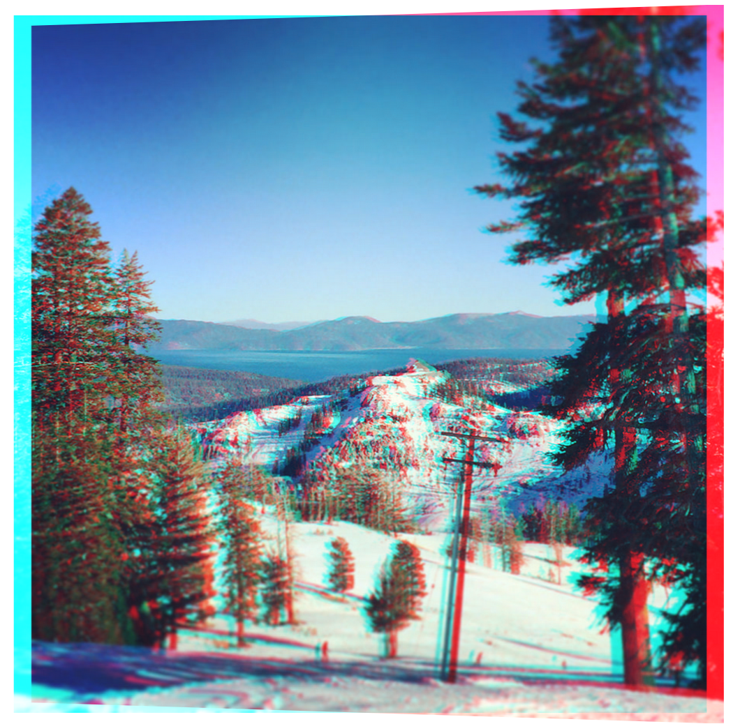
This uses the mixin without desaturation: `@include three-dee( 'http://una.im/images/posts/blend-modes/tahoe-prefilter.jpg', 5px, 7deg, 500px, 500px);`
tl;dr: Get your 3D glasses ready, because lighten / darken blend modes, and cmyk color mixing is here
{% include css-effects.html %}