
Modern CSS theming with light-dark(), contrast-color(), and style queries
Published on
I’ve been playing with a combination of new CSS features that, together, form a really nice dynamic theming system. This technique creates themed components with shadows in light mode that swap out to glowing borders in dark mode, and text that’s always readable against its dynamic background color. All in CSS. Available in all modern browsers as of May 2026 🥳.
Here’s what we’re combining:
@property: to register a custom property value with a meaningful syntax.light-dark(): resolve values based on the computedcolor-scheme(aligned to user preference queries)contrast-color(): auto-pick black or white text for any background based on the WCAG contrast algorithm@container style(): style queries branch into custom color palettes based on whatcontrast-color()resolves to
And an optional @function to make this all a bit cleaner to use (though it does limit the browser support).
⬇️ Let’s get into it.
Step 1: light-dark() as the foundation #
light-dark() is essentially an inline alternative to writing user-preference media queries based on theming. This function takes two color values and returns the first in a light color-scheme, the second in dark. It reads from the element’s computed color-scheme, which means it responds to both prefers-color-scheme and any explicit color-scheme property set in CSS or via JavaScript.
html {
  color-scheme: light dark;
}

body {
  /* Set a --bg custom property using light-dark() */
  --bg: light-dark(lightblue, black);
  background: var(--bg);
}
One thing worth highlighting: light-dark() responds to the computed color-scheme, not to prefers-color-scheme media queries. Setting color-scheme: light dark on the root tells the browser to respect the user’s OS preference, but you can override it by setting color-scheme: dark (or light) explicitly. This means you can override it at any level:
/* Respect OS preference by default */
html {
  color-scheme: light dark;
}

/* Force a section to dark regardless of OS preference */
.dark-section {
  color-scheme: dark;
}
Every light-dark() call inside .dark-section — including those inside @function --elevation() — will resolve to its dark value. This is more powerful than media queries because it’s inherited and composable.
Step 2: Swap the elevation mechanism #
In light themes, cards look elevated through shadows. But in dark themes, shadows disappear into the void… so you need a different elevation mechanism. In this case, we’ll create a subtle neon-ish border glow against dark surfaces.
light-dark() only accepts <color> values, so you can’t toggle entire shadow definitions with it. Instead, you can use light-dark() per shadow layer’s color, making unwanted layers transparent in the wrong mode:
.card {
  box-shadow:
    /* Subtle shadow--visible in light, transparent in dark */
    0 1px 2px light-dark(lightgray, transparent),
    0 4px 12px light-dark(lightgray, transparent),
    0 12px 32px light-dark(lightgray, transparent),

    /* Glowy border--transparent in light, visible in dark */
    inset 0 0 0 1px light-dark(transparent, oklch(from var(--bg)
    calc(l + 0.5) c h / 0.5)),
    0 0 16px light-dark(transparent, oklch(from var(--bg)
    calc(l + 0.5) c h / 0.3)),
    0 0 3px light-dark(transparent, oklch(from var(--bg)
    calc(l + 0.5) c h / 0.5));
}
All 6 shadow layers are technically always present, but 3 are transparent at any given time.
Additionally, for the glowy border, relative color syntax (oklch(from var(--bg) ...)) derives the glow colors from the card’s background, so the elevation always feels tinted to the card.
Step 3: Automatic contrast with contrast-color() #
I wrote about contrast-color() a few months ago. It’s a newly-available function takes any color and returns either black or white, whichever has higher contrast against that input. Here, we use it to ensure card text is always readable regardless of the brand color:
.card {
  --bg: var(--brand-color);
  background: var(--bg);
  color: contrast-color(var(--bg));
}
That’s it. One line for accessible text. But black and white can feel harsh, which brings us to the last step.
Step 4: Customizable palettes with style queries #
Style queries let us use contrast-color() as a detector value. “Am I on a light surface or a dark surface?”, and then branch into richer color palettes. I wrote more about this technique in contrast-color() beyond black & white.
First, register a custom property and set it to the contrast-color result:
@property --contrast-color {
  syntax: "<color>";
  initial-value: white;
  inherits: true;
}

.card {
  --bg: var(--brand-color);
  --contrast-color: contrast-color(var(--bg));
  color: var(--contrast-color);
}
Then use @container style() to branch:
/* If contrast-color is white, its on a dark background:
   Use warmer light colors */
@container style(--contrast-color: white) {
  .card-label,
  .card-body {
    /* Relative color palette for body and label text */
    color: oklch(from var(--bg) 0.9 0.1 h);
  }
}

/* If contrast-color is black, it's on a light background:
   Use deep tones derived from the card's hue */
@container style(--contrast-color: black) {
  .theming-card-label,
  .theming-card-body {
    color: oklch(from var(--bg) 0.3 0.1 h);
  }
}
Instead of snapping to pure black or white, text gets tinted toward the card’s own hue — deep indigo on a light lavender card, warm cream on a dark teal card. Relative color syntax (oklch(from var(--bg) ...)) derives the shade from a single brand color.
You can also set the color values explicitly instead of using relative color syntax. Just be sure to test your color combinations because now you can’t rely on the output of contrast-color() directly.
Putting it all together #
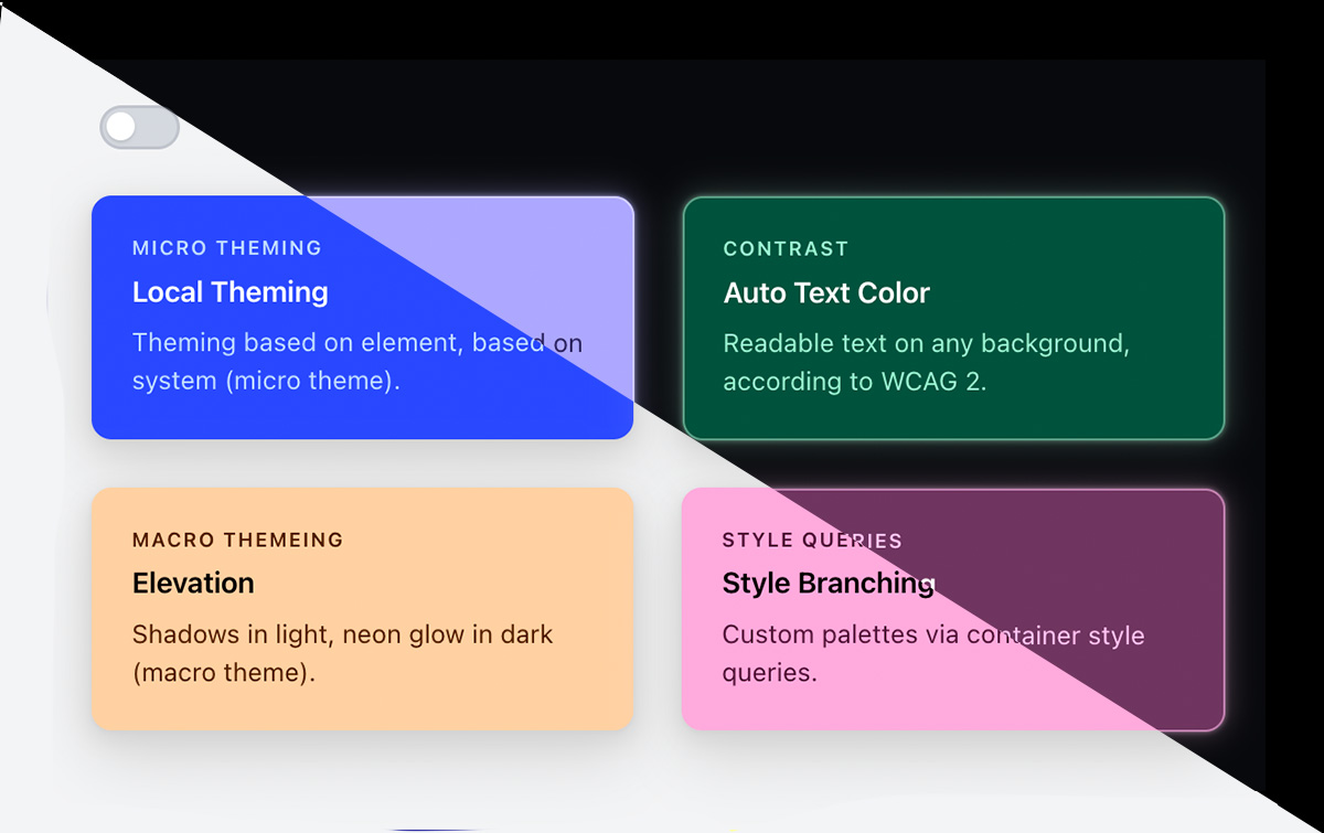
Pulling this all together lets you separate macro theming (full-page light and dark theming, styled with light-dark()) from micro-theming (the theme inside of the card/element itself, taking advantage of contrast-color()).
For example, you might have a page-level dark theme where you’ll want to apply the elevation styles, but you could also have a lighter-background or darker-background card on this theme. In this instance, you get more reliable output and more dynamic color theme permutations by taking advantage of contrast-color() and all of these techniques.
Here’s the full demo — toggle the theme to see shadows swap to glow borders, and notice how each card’s text palette shifts based on its surface. You can also play with it on CodePen.
Each card receives only a --brand-color (itself using light-dark() for theme-appropriate values). From that, the system derives:
- Background — the brand color itself
- Elevation mechanism — gray shadows or glowy border relative to the background
- Text color —
contrast-color()picks black or white, and style queries branch into hue-tinted light or dark tones
Browser support #
As I mentioned at the top of the article, this technique is Baseline Newly Available, meaning it’s stable in all browser engines as of May 2026.
If you want to clean it up with @function, the support is currently limited to Chrome 139+.
Conclusion #
The combination of light-dark(), @container style(), and contrast-color() creates a theming system that’s declarative, composable, and takes advantage of different levels of color theming. It respects user preferences (via color scheme) for macro theme, and lets you build dynamic micro themes. You can take this even further by building out an entire brand system using modern CSS color functions!
To learn more: