
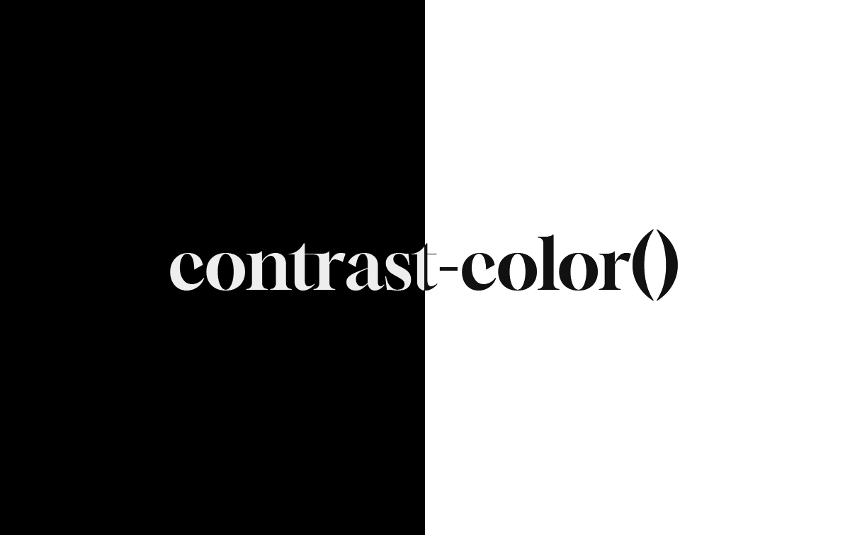
Automated accessible text with contrast-color()
Published on
I used to work in the design systems space, so color systems are quite close to my heart. But one of the things that has always been missing on the web, IMO, is a native color contrast function. That is, until now. contrast-color() will be landing in Chrome 147, stable by the end of March, making it newly available in all modern browsers.
Back in the day when I used Sass, there was an extension framework called compass which came with a default contrasted() function (Used in some of my old demos. And taking it a step further, you. could write your own contrast algorithms directly in Sass. It’s about time we got this functionality in native CSS. So what does it do, exactly?
TLDR;
contrast-color()takes any color and returns eitherblackorwhite, whichever provides the highest contrast against the input color.
The syntax #
contrast-color() takes a single argument: any valid CSS <color> value.
color: contrast-color(purple);
/* Returns: white */

color: contrast-color(yellow);
/* Returns: black */

color: contrast-color(var(--brand-color));
/* Returns: whichever of black or white has higher contrast */
Under the hood, the browser calculates the contrast ratio of both white and black against your input color to meet the WCAG 2 AA minimum contrast ratio of 4.5:1 for normal text. Whichever one has the higher contrast ratio wins. If they happen to tie (as with a perfectly mid-gray), it returns white. This feature obviously works best with backgrounds that aren’t mid-tones, where the WCAG 2 algorithm doesn’t do a great job.
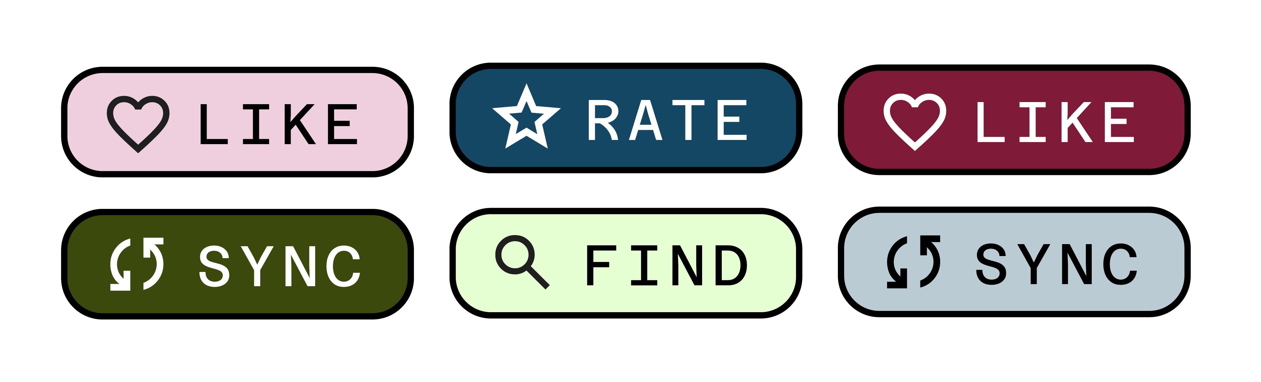
Basic Demo: Dynamic buttons #
Imagine you have a design system with different-colored buttons that have text on top. You need to make sure this text is always accessible, but now you just need one line of code to always choose a contrasting text color.
All you need to do to get this working is:
.button {
  background-color: var(--brand-color);
  color: contrast-color(var(--brand-color));
}
Dark mode with prefers-color-scheme #
You can combine contrast-color() with media queries to automatically get readable text in both light and dark modes:
:root {
  --bg: #eee;
}

@media (prefers-color-scheme: dark) {
  :root {
    --bg: #222;
  }
}

body {
  background-color: var(--bg);
  color: contrast-color(var(--bg));
}
Now you don’t have to manage a second color property for both themes. You just need one contrast-color() declaration.
Hover states and generated palettes #
Even in situations where colors are generated algorithmically (via color-mix() etc.), contrast-color() keeps you covered, and again, reduces code repetition:
contrast-color() automatically switches the text from white to black:
.card {
  --bg: oklch(0.6 0.15 250);
  background: var(--bg);
  color: contrast-color(var(--bg));

  &:hover {
    --bg: color-mix(in oklch, oklch(0.6 0.15 250) 40%, white);
  }
}
Wrap up #
contrast-color() is a good start to making CSS color palettes more dynamic. While the current version is simple, I hope in time we can have more advanced functionality like going beyond black and white as contrast colors. For now, if you’re building themes, or anything with dynamic color (which I hope you are!), this will save you time and make accessible color contrast a little bit easier.
Further reading: