
CSS Image Effects #4: Bokeh Textures
Published on
This is part of a series of posts breaking down visual effects using CSS filters and blend modes. Read Part 1: The Vintage Washout Effect, Part 2: 3d Glasses, and Part 3: Vignettes for some background on blend modes. In this post we’ll explore a popular photography technique called bokeh and how to recreate the illusion of a bokeh-style image. P.S. in this post I refer to the little dots of light created via this blur as “bokehs.” Please don’t be mad about it :)
So What is Bokeh?
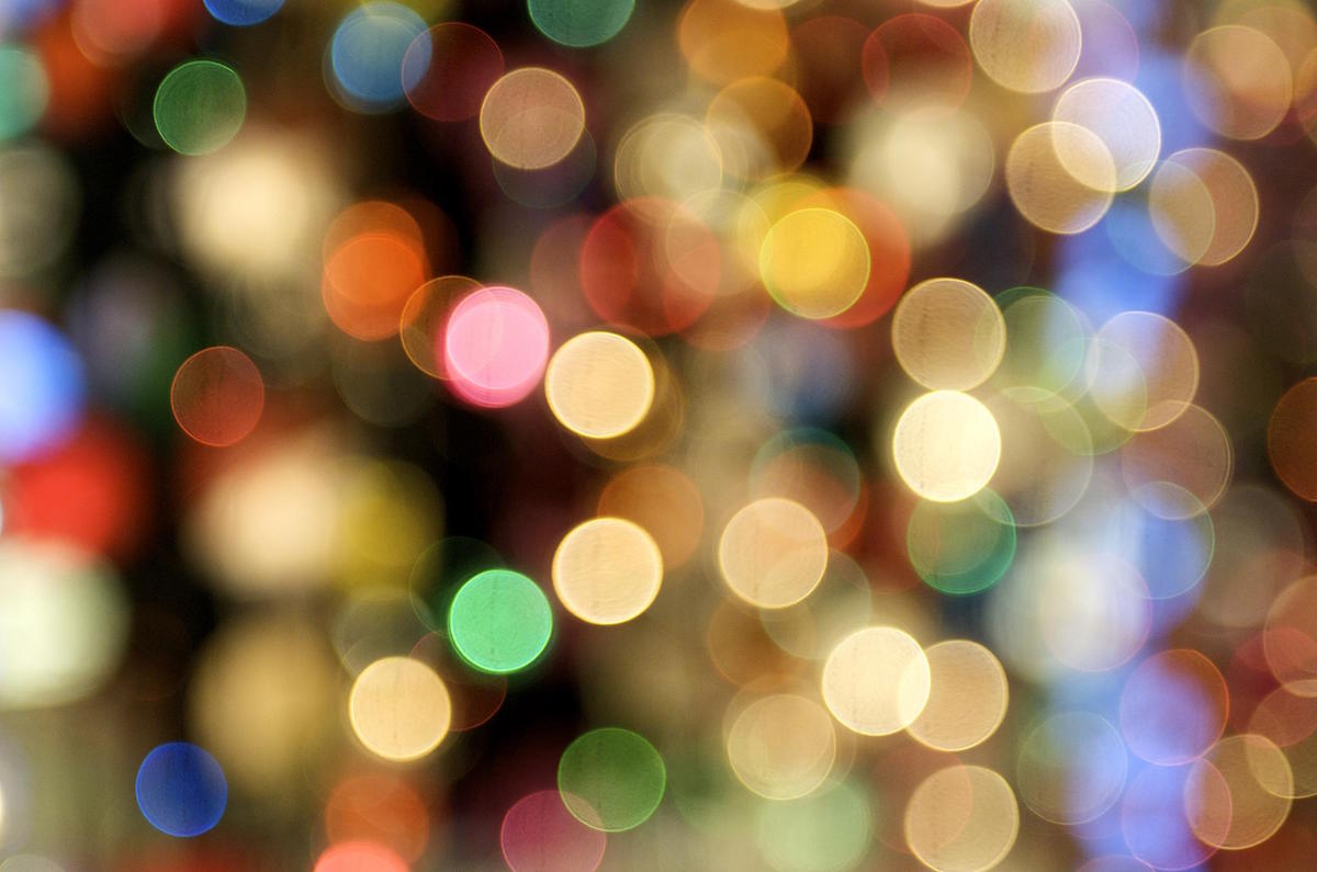
Bokeh is a photography technique that creates intentional blur for visual effect. The name itself stems from the Japanese word for blur or haze: boke. 1 Technically, any image with a blur in it can be considred bokeh, but they are most distinguished by the imagery of large circluar forms on photographs.
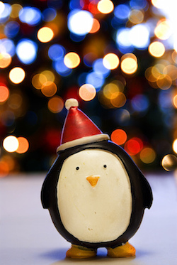
Christmas lights are popularly used to get this effect, and so are night scenes. Often, bokeh photography is simple round shapes, but can also include subjects in the foreground. Let’s look into how we can recreate the illusion of bokeh photography in CSS.
Applying Texture
Let’s start with some blend modes — particularly multiply and screen are going to be your friends when applying texture (also Google). All you really need to do is layer a texture on top of an image and multiply if the texture is white, or screen if the texture is on a black background. It’s super easy!
mix-blend-mode: screen(See Codepen)
See, aren’t blend modes fun? 😊 There are so many textures you can play with. Just Google search what you’re looking for, and feel free to get carried away.
CSS Gradients
CSS Gradients and box shadows are extremely powerful for creating a variety of visualizations. We can leverage them for building custom bokeh effects, too! Check out the Vignette article for more of a baseline on gradients.
We can make this gradient become a distinct circle by making sure the stops overlap, like so:
To make this look more like a bokeh effect, however, we’ll want to make this a circular shape and maybe have a bit of blur on the edges. Keep in mind, we can also position this circle anywhere within the element:
Creating Bokeh Patterns
Now, we’re almost there. The really fun thing about CSS gradients is that you can have as many as you’d like. You can use the above technique combined with positioning to create entire patterns like this:
Randomly Generated Bokeh
And the best part is that you can take that and randomize it! Since this series is sticking to CSS — I’ll show you an example of using the Sass random() function to create this effect without all of that typing. Now, keep in mind, Sass compiles to CSS, so random() is not truly “random” upon page refresh, but it is random upon each recompilation.
So let’s start with a Sass function for a single Bokeh:
// Sass
@function randomBokeh($size: 100, $spread: 3) {
  $randomColor: rgba(random()*255, random()*255, random()*255, random());
  $singleBokeh: radial-gradient(random()*$size+px at random()*$size*$spread+px random()*$size*$spread+px, $randomColor, $randomColor 96%, transparent);
  @return $singleBokeh;
}

.bokehs {
  width: 100%;
  height: 400px;
  background: randomBokeh();
}
/* CSS Output */
.bokehs {
width: 100%;
height: 400px;
background: radial-gradient(29.73333px at 17.50791px 7.48488px, rgba(100, 168, 142, 0.97455), rgba(100, 168, 142, 0.97455) 96%, rgba(0, 0, 0, 0));
}Now, we can create a Sass function to loop through and make as many bokehs as we want!
// All the bokehs
@function gimmeBokehs($howMany: 10, $size: 100, $spread: 3) {
  $bgList: ();
  @for $i from 1 through $howMany {
    $bgList: append($bgList, randomBokeh($size, $spread), comma);
  }
  @return $bgList;
}

.bokehs {
  width: 100%;
  height: 400px;
  background: gimmeBokehs(20, 60, 10)
}
/* CSS Outut */
.bokehs {
width: 100%;
height: 400px;
background: radial-gradient(42.72811px at 304.55032px 69.5741px, rgba(200, 147, 255, 0.50688), rgba(200, 147, 255, 0.50688) 96%, rgba(0, 0, 0, 0)), radial-gradient(14.78788px at 121.83054px 240.35838px, rgba(200, 156, 238, 0.93022), rgba(200, 156, 238, 0.93022) 96%, rgba(0, 0, 0, 0)), radial-gradient(46.62831px at 94.34362px 348.44101px, rgba(200, 255, 209, 0.36045), rgba(200, 255, 209, 0.36045) 96%, rgba(0, 0, 0, 0)), radial-gradient(50.7989px at 13.48329px 60.76727px, rgba(200, 156, 223, 0.23304), rgba(200, 156, 223, 0.23304) 96%, rgba(0, 0, 0, 0)), radial-gradient(29.85886px at 445.38605px 86.69019px, rgba(200, 88, 255, 0.40567), rgba(200, 88, 255, 0.40567) 96%, rgba(0, 0, 0, 0)), radial-gradient(15.46872px at 384.19081px 223.41316px, rgba(200, 206, 228, 0.58455), rgba(200, 206, 228, 0.58455) 96%, rgba(0, 0, 0, 0)), radial-gradient(27.29657px at 174.63441px 69.86441px, rgba(200, 191, 255, 0.68286), rgba(200, 191, 255, 0.68286) 96%, rgba(0, 0, 0, 0)), radial-gradient(28.55569px at 42.5358px 199.80861px, rgba(200, 83, 255, 0.35207), rgba(200, 83, 255, 0.35207) 96%, rgba(0, 0, 0, 0)), radial-gradient(44.88105px at 324.30742px 179.19289px, rgba(200, 249, 255, 0.96513), rgba(200, 249, 255, 0.96513) 96%, rgba(0, 0, 0, 0)), radial-gradient(56.65911px at 276.17854px 328.82421px, rgba(200, 255, 255, 0.80879), rgba(200, 255, 255, 0.80879) 96%, rgba(0, 0, 0, 0)), radial-gradient(1.50256px at 8.89644px 307.86249px, rgba(200, 123, 215, 0.43712), rgba(200, 123, 215, 0.43712) 96%, rgba(0, 0, 0, 0)), radial-gradient(6.73496px at 573.19463px 200.36501px, rgba(200, 255, 255, 0.63492), rgba(200, 255, 255, 0.63492) 96%, rgba(0, 0, 0, 0)), radial-gradient(41.59125px at 370.85632px 269.10117px, rgba(200, 123, 255, 0.75385), rgba(200, 123, 255, 0.75385) 96%, rgba(0, 0, 0, 0)), radial-gradient(15.8851px at 89.81562px 87.5804px, rgba(200, 159, 255, 0.40528), rgba(200, 159, 255, 0.40528) 96%, rgba(0, 0, 0, 0)), radial-gradient(5.83483px at 418.45742px 27.21459px, rgba(200, 91, 255, 0.11832), rgba(200, 91, 255, 0.11832) 96%, rgba(0, 0, 0, 0)), radial-gradient(36.02768px at 174.25894px 426.27577px, rgba(200, 90, 237, 0.03737), rgba(200, 90, 237, 0.03737) 96%, rgba(0, 0, 0, 0)), radial-gradient(6.5848px at 129.48342px 278.22334px, rgba(200, 88, 255, 0.31982), rgba(200, 88, 255, 0.31982) 96%, rgba(0, 0, 0, 0)), radial-gradient(31.3291px at 253.3642px 346.42431px, rgba(200, 243, 255, 0.48109), rgba(200, 243, 255, 0.48109) 96%, rgba(0, 0, 0, 0)), radial-gradient(52.24982px at 68.79468px 539.88069px, rgba(200, 255, 255, 0.09886), rgba(200, 255, 255, 0.09886) 96%, rgba(0, 0, 0, 0)), radial-gradient(3.93163px at 573.94226px 75.22354px, rgba(200, 221, 255, 0.60513), rgba(200, 221, 255, 0.60513) 96%, rgba(0, 0, 0, 0));
}which looks like:
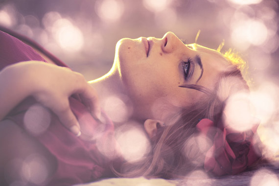
Bokeh Portraits
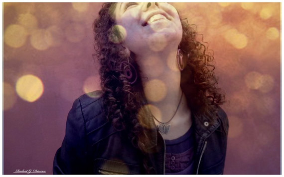
You can really play around with the colors on the random function above. Simply adding to the random values will give you a lighter color and less variation (i.e. $randomColor: rgba(random()*255 + 200, random()*255 + 100, random()*155 + 200, random());). So we can do that as well as use one of our blend modes and combine it with a basic portrait to make some of those fun effects!
In the example below, on the second dog, I am changing the random color variable as such:
$randomColor: rgba(200, random()*255 + 80, random()*155 + 200, random());And applying background: gimmeBokehs(30, 50, 6); as well as a mix-blend-mode: screen;:
Alternatively, if you’d like a more uniform color in your bokehs (like in the images above) , remember, you can always use filters such as grayscale, hue-rotate, saturate, brightness, etc. Here’s an example of the random bokehs from above, but with a filter: sepia(.75) applied:
So we can use that in combination with images like this pen (I recommend opening the pen and recompiling the code to see how it randomizes and changes). It’s a more subtle and usable way to integrate this effect:
Conclusion and Warnings
This effect is pretty dynamic and fun to play with. Keep in mind, however, creating 60 gradients on your page is not the most performant option at this point! I hope you picked up some new Sass tips from this post and some new ideas to #artTheWeb!
tl;dr: you can create bokeh-like dot effects via CSS gradients and apply them to your images. Using Sass makes it much easier.
{% include css-effects.html %}