
Updates to the customizable select API
Published on
A few months ago, I shared a blog post outlining the current state of the customizable select prototype and asking for developer feedback. Since then, a lot has changed! And for the better. There were a few things re-named, and significant changes to the user agent stylesheet. Now that this feature has evolved and is shipping soon, here is a list of updates since the RFC.
High-level overview of changes: #
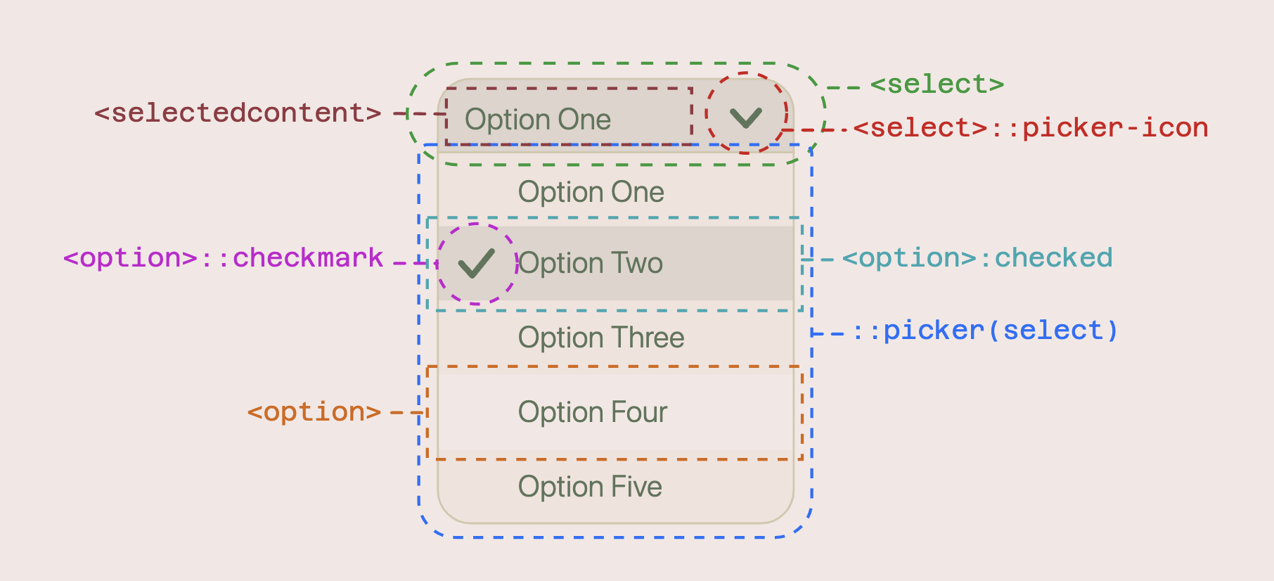
::select-fallback-buttonwas removed, and thebuttonitself is nowdisplay: contents. This means, styles for the button should be put on theselectelement instead.- The dropdown arrow icon was changed from
select::aftertoselect::picker-icon - Checkmarks that indicate the selected option were changed from
option::beforetooption::checkmark <selectedoption>was renamed to<selectedcontent>- Many styles were removed from the user agent stylesheet, such as default shadows, border-radius, and font styles
- Options now are styled using flexbox instead of block layout
I’m very happy to see the changes land that changed the use of existing pseudo elements (::before and ::after) to use new ones for the built-in checkmarks and icons (::picker-icon and ::checkmark). I think this makes a lot more sense and something I had advocated for! I’m also happy to see the rename of <selectedoption> to <selectedcontent>, which Jake Archibald brought up as being a potential source of confusion in his podcast, Off the Main Thread. Finally, I’m happy to see a less-intrusive UA stylesheet applied to this element. I’m always a fan of the less-is-more approach when it comes to these customizable components, because after all, the entire idea is to make them your own. And the fewer browser-provided styles you need to undo the better 😄.
Recap of usage #
Opt-in mode #
To use the new customizable select, you need to “opt-in” with appearance: base-select on both the select itself and the picker (you may know the picker as the “dropdown”).
select, ::picker(select) {
  appearance: base-select;
}
Now, you can style the select however you want and have access to new elements and pseudo classes.
New elements and pseudos #
With these updates, if you want to style the button directly, you style select. You can also use the :open pseudo class to style the select and its picker if the picker is open.
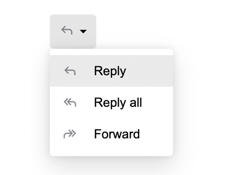
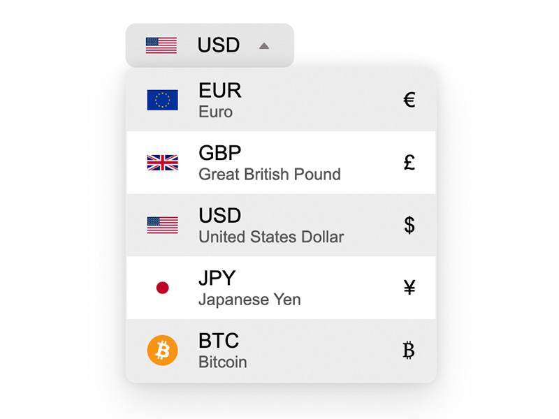
selectis the parent element. It also acts as the button you click on to open the picker::picker(select)is a shadow DOM element that contains the optionsoption::checkmarkcontains the checkmark of the selected optionselect::picker-iconcontains the arrow icon (▼) in the button that opens the pickerselectedcontentis an element you can use inside ofselectto mirror the inner HTML of the currently selected optionselect:openstyles the select button when the picker is openoption:checkedstyles a selected option in the picker
Demos #
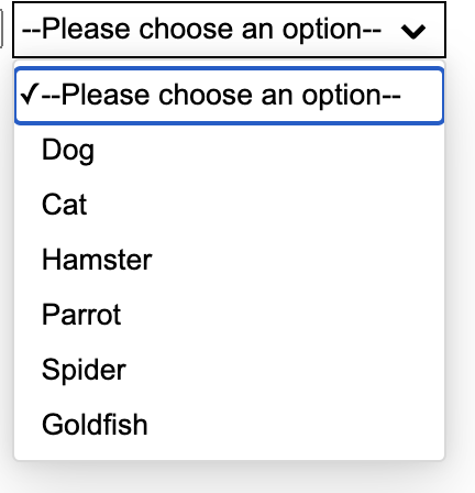
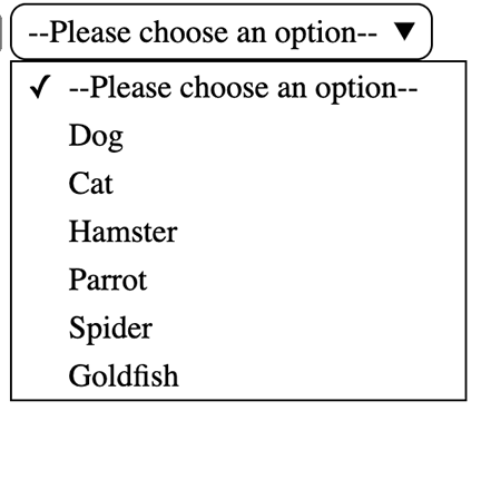
I have updated my demo collection with the latest syntax based on the resolutions and API updates outlined above. Definitely check them out for some inspiration and to see this feature live:
Conclusion #
Thank you to everyone who provided feedback and big shoutout to all the folks working on bringing this feature to life (particularly the OpenUI community group and Joey Arhar, who has been the primary engineer patiently prototyping and re-prototyping this feature through numerous syntax and behavioral changes)!
I’m so excited to see this finally landing in Chrome! It’s a huge win for the web 🥳