
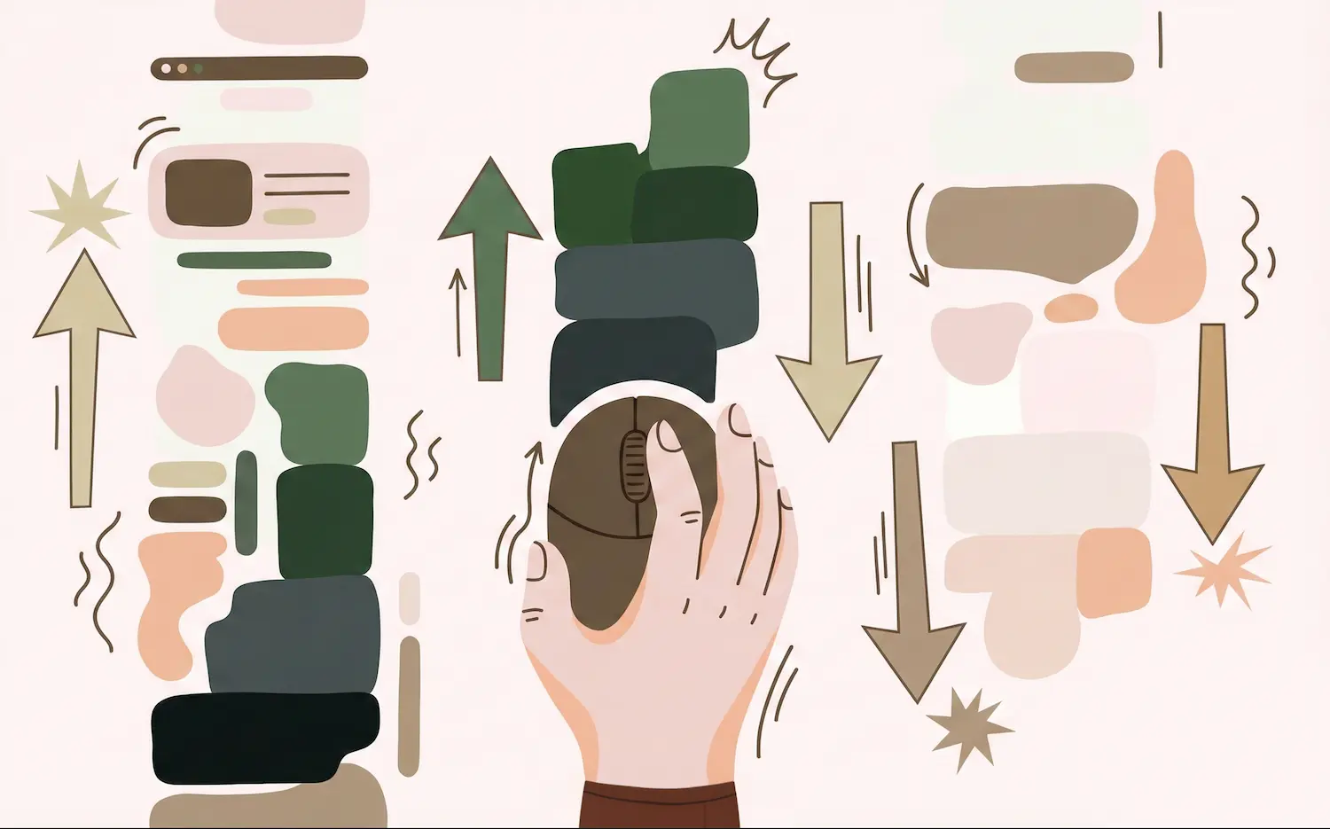
Directional CSS with scroll-state(scrolled)
Published on
There’s a new scroll-state() query in town, and it’s rolling out in Chrome 144. The scrolled state query lets you apply styles based on the last scroll direction of your user’s well.. scroll. This unlocks a ton of new possibilities, and I couldn’t help but get my hands on trying it out.
How It Works #
The scrolled value is the newest addition to scroll-state() queries: a set of container queries that respond to how a user interacts with the page scroller. Landing in Chrome 133, the other scroll-state queries include:
stuck: for style changes when an element is stuck to an edge (i.e. “is-sticky”).snapped: for when an element is snapped on an axis (i.e. in a scroller, like the active item in a carousel)scrollable: for styles when an element has overflow
To use any state query, you first set up a container-type: scroll-state on the parent element:
.parent {
  container-type: scroll-state;
}
Once you’ve done this, you can use scroll-state() like any other @container query.
.child {
  /* styles */

  @container scroll-state(<type>: <value>) {
    /* scroll-based styles */
  }
}
The scrolled query #
For scrolled, you want to make sure that the parent scroller has somewhere to scroll.
html {
  container-type: scroll-state;
  overflow: auto;
}
Once the container is set up, you can query the scrolled state to detect the direction of the most recent relative scroll. The values it accepts are: top, right, bottom, left, and their logical counterparts (block-start, inline-start, block-end, inline-end) as well as the multi-directional axis-based shorthands of x, y, block, and inline. Another value this accepts is none, which indicates that the query container has not had a relative scroll yet.
The browser updates this state whenever the user scrolls, allowing you to style descendants based on whether the user is moving down, up, left, or right.
/* Styles when the user has scrolled down */
@container scroll-state(scrolled: bottom) {
  .header {
    transform: translateY(-100%);
  }
}

/* Styles when the user has scrolled up */
@container scroll-state(scrolled: top) {
  .header {
    transform: translateY(0);
  }
}
Demo: Hidey-bar with fixed positioning #
One great use-case for scroll-direction is to show and hide application frame. A common pattern is to hide the header bar or navigation bar when you scroll down into the page, and resurface it when you start to scroll back up. This way, you get the advantage of increased screen real estate while also not having to scroll all the way back up to the top of the page to access the header bar navigation.
You can now soon do all of this with just a little bit of CSS.
Bramus shows us one way to do this by leveraging scroll-state(scrolled) to implement this pattern in his recent blog post. His take demonstrates a fixed position top nav, which hides when you scroll toward the bottom:
html {
  container-type: scroll-state;
}

/* Show by default */
header {
  position: fixed;
  inset: 0 0 auto;
  transition: translate 0.2s;
  translate: 0 0;

  /* Hide when you scroll toward the bottom */
  @container scroll-state(scrolled: bottom) {
    translate: 0 -100%;
  }
}
By showing the nav bar by default and hiding it upon scroll, you can use this API as a progressive enhancement. For unsupported browsers, the nav bar will always be visible (fixed position).
See the Pen Hidey Bar Demo (Hide on Scroll Down, Show on Scroll Up // Scroll State Queries) by Bramus (@bramus) on CodePen.
Demo: Hidey-bar with sticky positioning #
If you want to make it work a different way, here’s my take: on my current website I have a navbar at the top which is a relatively-positioned sibling to the main content. It doesn’t scroll with the page, but remains at the top. To get back to the nav bar you need to scroll all the way back up to find it.
Let’s make it show and hide using this new API:
html {
  container-type: scroll-state;
}

header {
  /*  Convert to position:sticky and add transition
      when a scroll occurs  */
  @container (not scroll-state(scrolled: none)) {
    position: sticky;
    top: 0;
    transition: translate 0.2s;
  }

  /* Hide when you scroll down */
  @container scroll-state(scrolled: bottom) {
    translate: 0 -100%;
  }

  /* Appear when you scroll back up */
  @container scroll-state(scrolled: top) {
    translate: 0 0;
  }
}
I prefer this approach, (👀 and just added it to my site), because it doesn’t change the existing experience for users in unsupported browsers. The navbar takes up space, as it did before, and doesn’t scroll with the page, as it’s not position: fixed. Once you begin to scroll, the navbar animates out toward the top, and comes back in when you begin to scroll back up. Everything is encapsulated in an @container scroll-state(scrolled: x) so nothing leaks to unsupported browsers, which simply ignore everything inside of those blocks.
This is a perfect example of progressive enhancement that I can build on top of my existing site UI without breaking anything.
See the Pen Progressively Enhanced hidey bar with scroll-state(scrolled) by Una Kravets (@una) on CodePen.
Demo: Directional scroll entry animation #
One key principle of animation is to always animate an element from the direction you are activating it. This means if you’re opening a tooltip it should open out from the button you’re using to invoke it, giving it a more natural motion. If it were to open from the center, for example, it might make it feel unnatural, or “off”.
So I explored using this new API in combination with another new feature, scroll-triggered animations, to change the transform-direction depending on the scroll-direction.
See the Pen Bi-directional scroll with scroll-triggered animations and scrolled state query by Una Kravets (@una) on CodePen.
In this example, I have two sets of animations:
@keyframes slide-up {
  from { opacity: 0; transform: translateY(50px); }
  to   { opacity: 1; transform: translateY(0); }
}

@keyframes slide-down {
  from { opacity: 0; transform: translateY(-50px); }
  to   { opacity: 1; transform: translateY(0); }
}
The main thing here is: I set the default animation to slide-up, and change it to slide-down when you scroll to the top.
html {
  container-type: scroll-state;
}

.card {
  animation: slide-up 0.6s ease-out forwards;
}

.indicator::after {
  content: "Scrolling Down ↓";
}

@container scroll-state(scrolled: top) {
  .card {
    animation-name: slide-down;
  }

  .indicator::after {
    content: "Scrolling Up ↑";
  }
}