
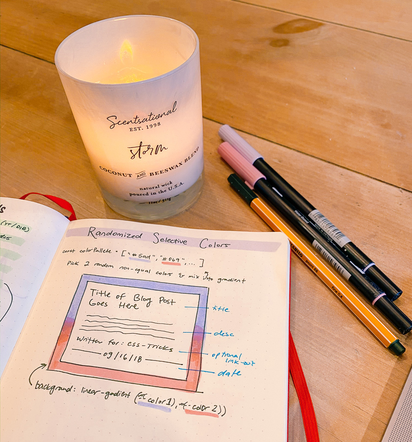
Randomized Selective Color: A Post List Study
Published on
We’ve been stuck inside for a few weeks now, and today, as I’m slowly awakening out of my daze of playing Animal Crossing and watching 90 Day Fiancé reruns, I have a thought. You know what I’ve been meaning to redesign/rebuild? You guessed it… my website! I think as creatives we feel this urge 4-10x a year, and laugh it off, but I figure, what better time than the present?
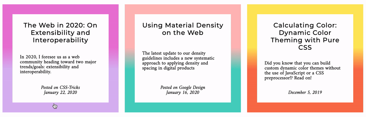
This post is a study on selective color (from a predefined list), by using CSS custom properties, a little bit of JavaScript, and some progressive enhancement with CSS Houdini. By the end, we’ll have something like this:
The Inspiration #
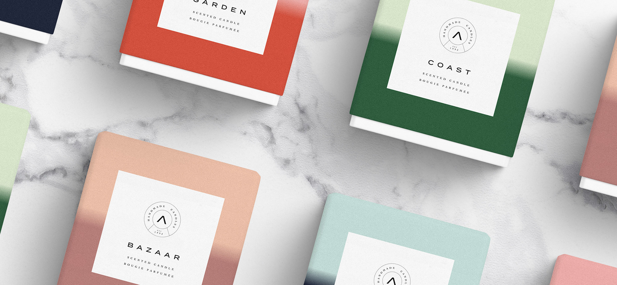
When I do design projects, I like to get inspiration from outside of the internet. And right now, I’ve been really into crafts (candle making, hand lettering, and more). Candle branding is beautiful and super interesting and succint, so I set a few different pieces of inspiration aside as I was thinking about this redesign. This Atolye brand study spoke to me specifically, and really caught my eye:
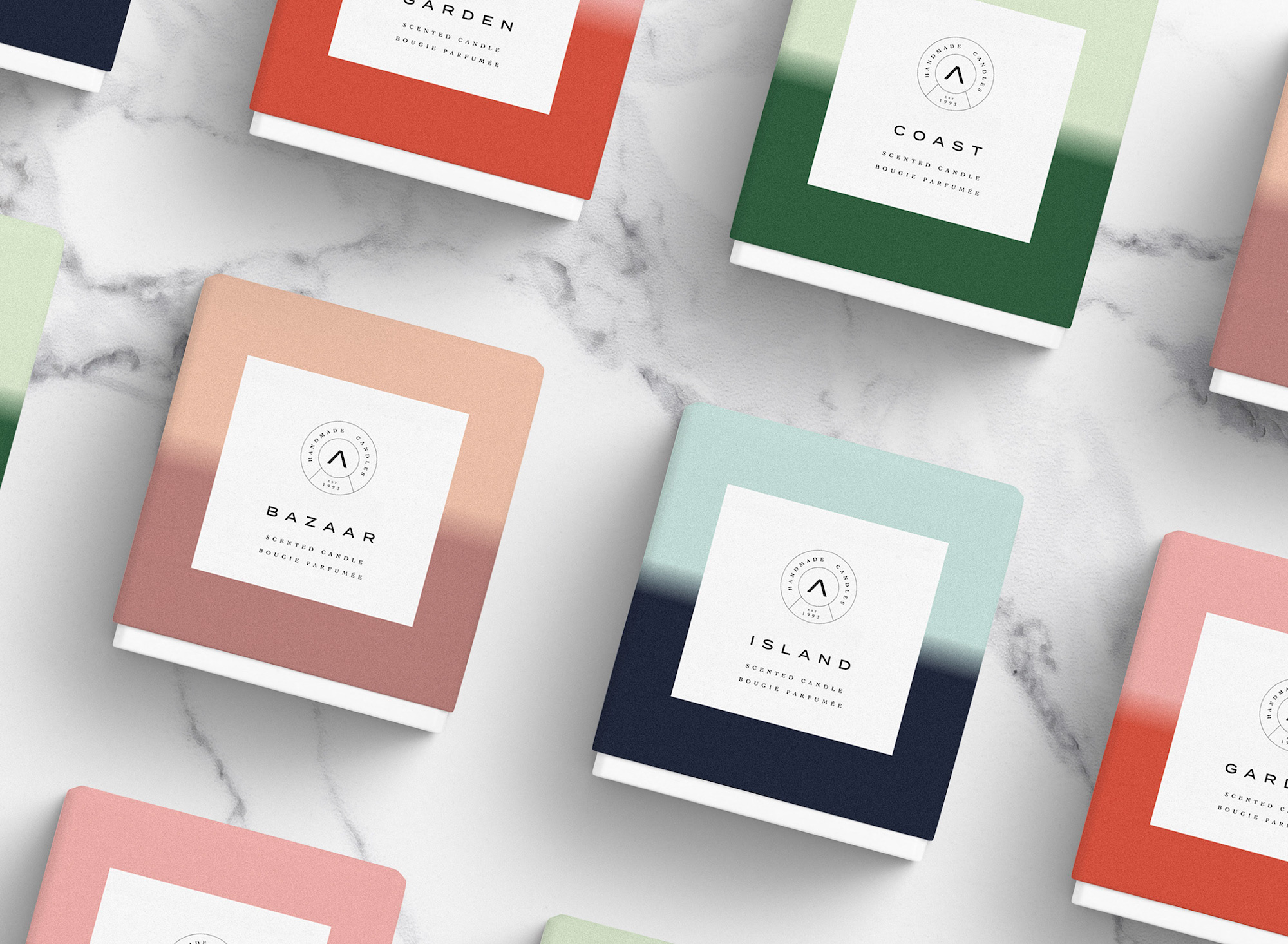
So as a CSS nerd, I was interested in recreating this gradient, and giving it a randomized color. But as a design nerd, I’m also well aware of the dangers of truly random color pairings. So, to get the best of both worlds (whimsy and delight from color combinations + fewer decisions to make and a beautiful set out outcomes), I decided to seed an initial theme palette from which to stay within.
So let’s set it up.
Setting it up #
See the Pen Randomized Selective Color Step 1: Setup by Una Kravets (@una) on CodePen.
I’m using flexbox for the card layout (my usual choice for these sorts of things), and set up custom properties for --color1 and --color2 locally within .post.
I love writing CSS gradients, and here I have a simple linear-gradient with stops at 40% and 60%, so that the gradient mix is only over 20% of the layout, making this “mixing in the middle” effect possible.
Randomizing Color #
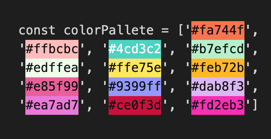
Now, to move into the realm of randomness, we must first start with out set of colors. I chose the these for a mix of bright and pastel ✨vibes✨. I highly recommend a color highlighting plugin for whatever code editor you’re using so that you can visualize and adjust colors right where your code lives.
Now, to get a random color from an array, we can use <Array>[Math.floor(Math.random() * <Array>.length)], so we’ll want to grab a first color, and then get another color while ensuring the second color is not identical to our first. There are a few different ways to do this. For simplicity and clarity, in the demo, I’m creating a new array without the first color by filtering out any matches: colorPalette.filter(function(val){ return val !== color1 }). From here, we can set this color as we did our first.
Finally, we’ll need to update those CSS custom properties on the .post itself. To set a property on an inline element you can do: <Element>.style.setProperty('--varName', <VarValue>). This will enable us to eventually run a loop over each .post item and apply unique colors. All together it looks like:
See the Pen Randomized Selective Color Step 2: Randomize Colors by Una Kravets (@una) on CodePen.
Go ahead and hit Rerun on the result above for some nice pseudo-randomly-generated gradients
Adding some Houdini #
Now let’s get to interaction! Another favorite of mine! I think it would look pretty smooth if we could have the gradient animate, maybe moving like a slider in the space.
Currently, animating gradients in CSS is pretty tricky, and not really possible without the help of JavaScript and some janky DOM painting. However, with an upcoming technology called CSS Houdini and the Paint API, we can create our own CSS custom properties that have semantic meaning! This enables us to reach inside of CSS functions, such as gradients, and inject semantic variables that we can then interpolate to other values and change them within interaction states!!!!
I’m not screaming, you are! 😂😅
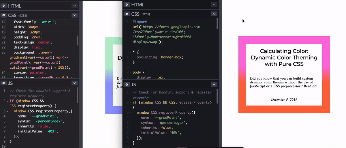
So first we’ll need to prepare a custom property called --gradPoint and give it some meaning. The current way to do this is through the CSS.registerProperty syntax in our JS file (though soon, this is changing to just @property, where it will be colocated in your CSS).
Current syntax (JS):
// Check for Houdini support & register property
if (window.CSS && CSS.registerProperty) {
  window.CSS.registerProperty({
    name: '--gradPoint',
    syntax: '<percentage>',
    inherits: false,
    initialValue: '40%',
  });
}
Future syntax (CSS):
/* Check for Houdini support & register property */
@supports (background: paint(something)) {
@property --gradPoint {
syntax: '<percentage>';
inherits: false;
initialValue: '40%';
}
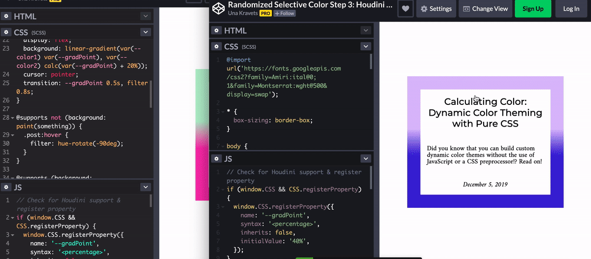
}Now that --gradPoint has a syntax (percentage), we can animate it to another percentage on hover or focus. We can also use this single variable to set our second gradient point by calculating its value based on --gradPoint via calc(var--gradPoint) + 20%).
.post {
  background: linear-gradient(var(--color1) var(--gradPoint), var(--color2) calc(var(--gradPoint) + 20%));
  transition: --gradPoint 0.5s;
}

.post:hover,
.post:focus {
  --gradPoint: 100%;
}
What About Fallbacks? #
So this will work great for browsers that support CSS Houdini, but look at what happens in an unsupported browser:
 Left: supported browser. Right: unsupported browser.
But we want our unsupported browsers to also have a cool hover/focus experience! So let’s use some CSS filters (namely the hue-rotate) filter to add a hue change on hover. Filter effects animate smoothly by default since they’re interoperable. Now it’ll look like this:
 Left: supported browser. Right: unsupported browser.
The supported browser gets the smooth gradient slide, and the unsupported browser gets a nice hue change. In our CSS, we can check for support to identify which styles we want to send like so:
@supports not (background: paint(something)) {
  .post:hover,
  .post:focus {
    filter: hue-rotate(-90deg);
  }
}

@supports (background: paint(something)) {
  .post:hover,
  .post:focus {
    --gradPoint: 100%;
  }
}
@supports is supported by all modern browsers, however there is no support in IE11. Because of this, typically you’d want to write your fallback outside of an @supports statement and let the @supports code override the fallback. Since filters are all not supported in IE11, writing it this way will lead to less code bloat.
See the Pen Randomized Selective Color Step 3: Houdini Hover by Una Kravets (@una) on CodePen.
That’s pretty much it! Thanks for following along, and feel free to tweet at me if you have any questions!