
Building a no-JS radial menu with CSS trigonometry, popover, and anchor positioning
Published on
This radial menu uses three modern CSS features: CSS trigonometric functions, the popover attribute (partially supported), and the anchor positioning API (not yet supported in stable browsers). I started this exploration out of an excitement to try out trigonometric functions for non-linear layout of a common UI component.
Trigonometric functions #
CSS trigonometric functions open the door for more organic web interfaces. By using these functions within calc(), you can animate elements along a curve, create non-linear layout placement, and make interesting visualizations in CSS.
As of March 2023, we now have full browser support in all modern browsers for the following trigonometric functions:
sin()cos()tan()asin()acos()atan()atan2()
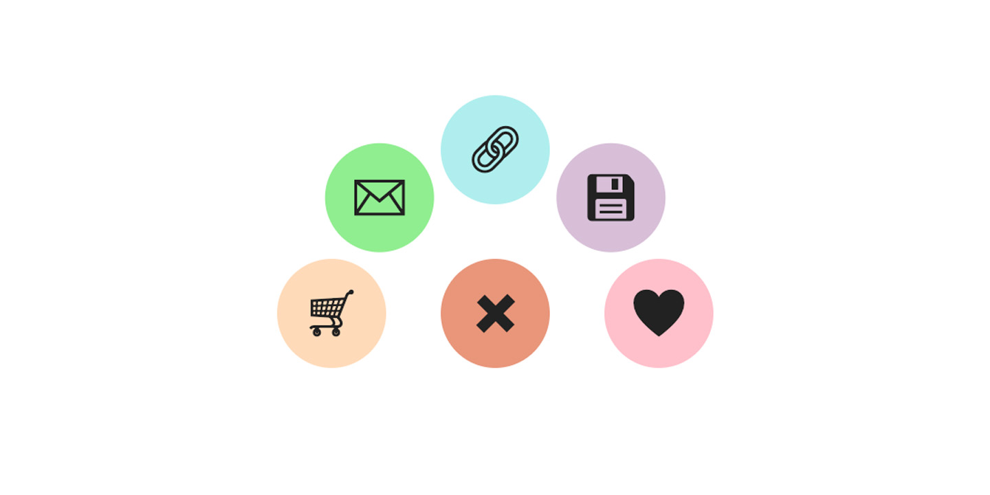
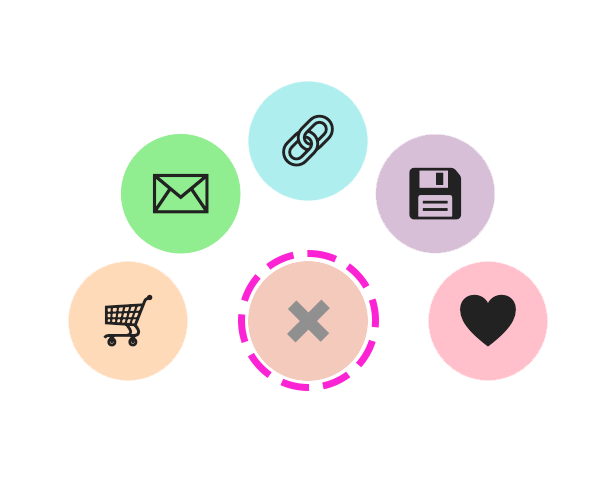
The Radial Menu #
Let’s build a radial menu that opens and closes from a single button and “flutters” out in a counter-clockwise circle. This menu was inspired by the mobile experience for the Pinterest app, where you would twirl it open to save or re-pin an item. Creating this kind of layout in vanilla CSS used to be hard, but it’s become a lot easier with trigonometric functions becoming available to us.
See the Pen Radial Menu with CSS trig functions by Una Kravets (@una) on CodePen.
Setting up the HTML #
To set this all up, we’ll need a trigger button and a list of buttons. That might look like this:
<div class="menu-container">
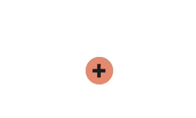
<button class="menu-toggle">
<span aria-hidden="true">➕</span>
<span class="sr-only">menu trigger</span>
</button>
<ul class="menu-items">
<li class="item">
<button>
<span aria-hidden="true">♥️</span>
<span class="sr-only">add to favorites</span>
</button>
</li>
<li class="item">
<button>
<span aria-hidden="true">💾</span>
<span class="sr-only">save to collection</span>
</button>
</li>
<!-- ... -->
</ul>
</div>You might notice above that I’m using aria-hidden and sr-only (or, screen reader only). These are accessibility affordances to be more specific with the voiceover experience.
Grid piles: the new absolute positioning #
I love the term “grid pile” now, after first hearing it in Adam Argyle’s blog post 6 CSS snippets every front-end developer should know in 2023. The tl;dr is that a grid pile is essentially the new position: absolute, which leverages grid areas instead of positioning. I’m setting up a bunch of grid piles to center everything before we start mathing the math for the positioning:
.menu,
.menu-items,
.item {
  display: grid;
  place-content: center;
}

.menu > *,
.menu-items > *,
.item button {
  grid-area: 1/1;
}
Mapping it out #
Remember geometry class? Where we learned about how to build triangles to measure distances using angles, lengths, and these trigonometric functions? Well, we’re going back to class to build this radial menu. First, let’s map out our plan.
We want the sub-items to arrange themselves in a circle around the entry point for the menu, which means we can to map them to triangles along the circular path:
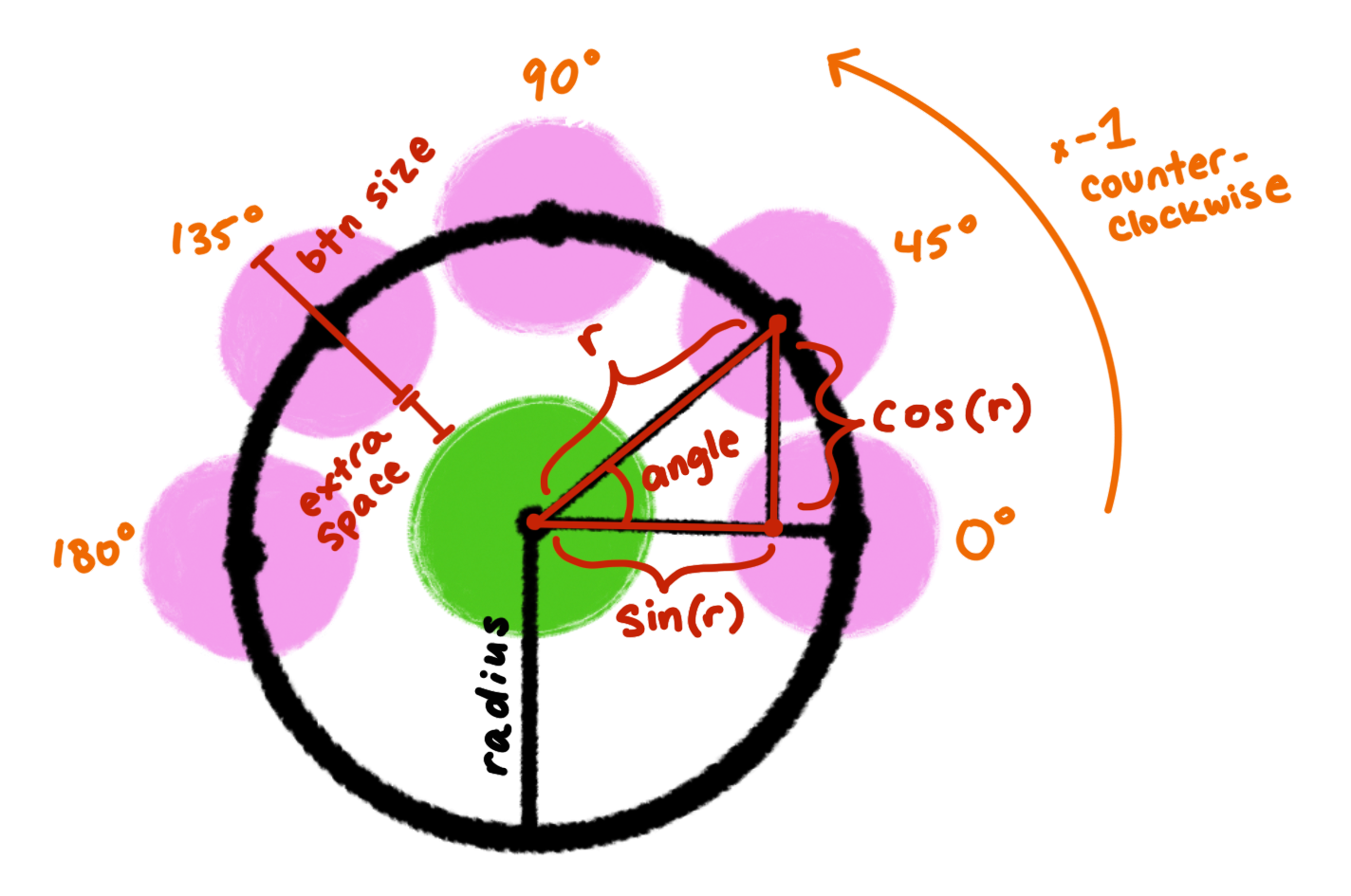
Calculating the positions #
What we know is the radius value, which is, the size of the menu items (--btn-size) plus the additional space seperation we want betwen those items and the menu entry point (--extra-space). That means we can now set radius as a custom property value for each item with --radius: calc(var(--btn-size) + var(--extra-space)).
Now that we have the radius, the next thing we’ll need is the angle that each menu item is from it’s initial starting point. Since we have 5 items, they map nicely to 0deg, 45deg, 90deg, 135deg, and 180deg.
We’ll set these individually on each item using nth-child, along with a color to differentiate them:
.item:nth-child(1) {
  --bg: pink;
  --angle: 0deg;
}

.item:nth-child(2) {
  --bg: thistle;
  --angle: 45deg;
}

.item:nth-child(3) {
  --bg:	paleturquoise;
  --angle: 90deg;
}

...
The angle is what we’ll need to set the direction of the position for our elements on the plane. But we also need the radius that we just calculated to apply the position.
The x position is cos(var(--angle)) * var(--radius)), and the y position is sin(var(--angle)) * var(--radius)). Well, almost. In order for our elements to appear above the entry point, we’ll need to flip that y value by muliplying it with -1, leaving us with a full transform function that looks like:
transform: translateX(calc(cos(var(--angle)) * var(--radius)))
          translateY(calc(sin(var(--angle) * -1) * var(--radius)));
Give this a transition-duration to see those items move into place when we click or focus on the menu-toggle button (or any of the menu items), and now we have this:
Transition delays #
To make this really engaging, we can add some slight delays to each menu item. This way, rather than pop out all at once, we’re going to pop out one at a time. In order to do this, we can use :nth-child and set an an animation-delay for each menu item.
.item:nth-child(1) {
  --delay: 0s;
}

.item:nth-child(2) {
  --delay: 0.1s;
}

.item:nth-child(3) {
  --delay: 0.2s;
}

.item:nth-child(4) {
  ...
}
Now we have a menu which looks like this:
sibling-count and sibling-index, which would make it possible to programmatically set delays like this (and dynamically calculate angle degrees such as the first section with the nth-child placement).Giving it a twirl #
Ok, so that pops out nicely, but it’s not giving twirly. For an added touch of twirl, we’ll set the initial rotation value of each menu item (hidden behind the entry item), to -45deg. Then, we can rotate it back to 0deg when they have reached their resting positions.
.item {
  --radius: calc(var(--btn-size) + var(--extra-space));
  background-color: var(--bg);
  transform: translateX(calc(cos(var(--angle)) * var(--radius)))
             translateY(calc(sin(var(--angle) * -1) * var(--radius)))
             rotate(0deg);
  transition: all 0.3s var(--delay) ease;
}

/* Initial state, before each item opens */
.menu:not(:focus-within) .item {
  --radius: 0;
  --angle: 0;
  rotate: 45deg;
}
This gives each icon a subtle “twisting” vibe that I think really adds to it.
As an added bonus, I love this tip from Tim Lucas to make the plus sign rotate when the menu opens. His demo fork also adds some really nice easing curves.
To make the plus sign twirl, add a 90deg rotation, like so:
/* rotate the plus icon, AKA first div with .menu-toggle */
.menu-toggle > div {
  transition: transform 0.3s;
}

.menu:focus-within .menu-toggle > div {
  transform: rotate(90deg);
}
To make it turn into an “X” (indicating this button now closes the menu), change the rotation to 45deg. So cute!
Making it more accessible with popover #
To make this accessible, you need to handle a few things:
- Hitting the
enterkey on the toggle button opens the menu - Hitting the
esckey needs exits the interaction - Tab focus is directed to the next menu item when open
- Accessible semantics are applied to the menu
Luckily, we get the first three for free with the upcoming popover attribute, which we can then layer semantic attributes on top of. And as a bonus, we also get light-dismiss behavior with popover="auto", meaning that if a user clicks outside of the menu, it will also close the menu. Yay! 🥳
To make a popover menu like this accessible without the popover attribute, you would need to use JavaScript. You could leverage the menu-toggle button to set aria-expanded=“true” on click or focus to open the menu, and set it to aria-expanded=“false” when it’s not open. Additionally, you would initially hide the .menu-items container from the accessibility tree with aria-hidden=“true”, just like we do with the icons above. Then, you can update it to aria-hidden=“false” when the menu is open.
To make this into a popover, the steps are much more straightforward and don’t require any additional scripting. First, you need to add an id and the popover attribute to the menu items. Then, you can set up the menu toggle as the popovertarget which by default opens the popover. That looks like:
<!-- Set id to link to and add popover attribute -->
<ul id="menu-items" popover>
  <li>...</li>
  <li>...</li>
</ul>

<!-- Set target to open popover with matching id on button click -->
<button popovertarget="menu-items">
  <span aria-hidden="true">➕</span>
  <span class="sr-only">open menu</span>
</button>
As popover doesn’t inherently ship with semantics, you need to add them. For a menu like this, you can use role="menu" on the ul and role="menuitem" on the child button elements. Learn more about popover semantics in Hidde’s post.
Now we have a popover! …But if you take a look at that in Codepen, it looks completely broken. The popover doesn’t have context to where it should appear.
Let’s fix the positioning and make sure the menu items always appear in place, anchored to our toggle button.
Setting up anchor positioning #
To set up anchor positioning, you need to give the anchoring element (in this case the button which opens the popover) an id, and then link the popover (or any element, it doesn’t have to be a popover), to the anchoring element.
<!-- Link the popover to the anchor button -->
<ul anchor="anchor-btn" id="menu-items" popover class="menu" role="menu">
  <li>...</li>
  <li>...</li>
</ul>

<!-- Give the anchor an id -->
<button id="anchor-btn" popovertarget="menu-items">
  <span aria-hidden="true">➕</span>
  <span class="sr-only">open menu</span>
</button>
Once you set up the HTML, you can place the popover like so:
.menu {
bottom: calc(anchor(bottom));
left: anchor(center);
translate: -50% 0;
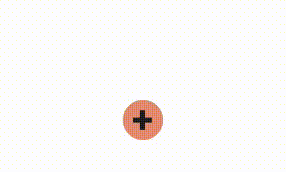
}So now we have anchored popovers! Yay! (Well, almost). One thing that’s interesting about popover is that you create this element on a new “plane” above the rest of the page. And if we’re anchoring to the center bottom of the button which opens this menu, then it overlaps our triggering button and you can no longer click on the button to close the menu. Popovers also have a white background by default. So, it looks like this once we anchor the popover:
To fix this, we’ll need to do two things:
- Remove the default white background from the
popoverelement to make it see-through. - Create an “invisible” menu item that acts as the closing button so you can navigate to it and use it.
Step 1: update the background so it “shows through”.
.menu {
  /*  popover override  */
  background: none;
}
Note that while the user can see the toggle button, they still won’t be able to access or click on that button. To fix that we’ll need to “add back” this closing capability as a menu item. You can do this with popovertargetaction="hide". So that brings us to Step 2: add a visually hidden hide button to the menu.
<li class="item">
<button popovertargetaction="hide" popovertarget="menu-items" class="hidden-close">
<span aria-hidden="true"> </span>
<span class="sr-only">close menu</span>
</button>
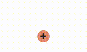
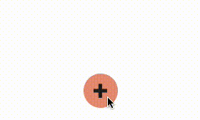
</li>Now we have an invisible close button, but a see-through popover, so it looks like the user is clicking on that button. This image illustrates where that new element appears and how it would overlap the existing button behind it, making it “feel” like you’re clicking it, when in fact you’re clicking on the invisible close button.
With the all together, here is what the final popover menu looks like!
See the Pen Radial Menu Popover by Una Kravets (@una) on CodePen.
Popover everywhere #
Now our popover should work all throughout the page (on browsers that support both anchor and popover, which is Chrome Canary at the time of this writing).
See the Pen Radial Menu Popover by Una Kravets (@una) on CodePen.
To support multiple menus like this, remember that each popover and anchor must be unique (or else you’ll be confusing which popovers you’re opening or where you are anchoring the element which you are toggling). So it will likely need to be be namespaced by a numeric id or by another naming system you are using. All together it looks like this:
<!-- Link the popover to the anchor button -->
<ul anchor="anchor-btn-01" id="menu-items-01" popover class="menu" role="menu">
  <li>...</li>
  <li>...</li>
</ul>

<!-- Give the anchor an id -->
<button id="anchor-btn-01" popovertarget="menu-items-01" role="menuitem">
  <span aria-hidden="true">➕</span>
  <span class="sr-only">open menu</span>
</button>
Conclusion & Further Reading #
This was my first time playing with CSS trigonometric functions (though not my first time playing with math and geometry in a canvas), and it was a lot of fun to do this directly in CSS! Being available across all modern browsers is pretty neat, and I’m excited to see what you build. For more on trigonometric functions in CSS, check out:
- Trigonometric functions in CSS by Bramus Van Damme
- Trigonometry in CSS and JavaScript: Introduction to Trigonometry by Michelle Barker
- Creating a Clock with the new CSS sin() and cos() trigonometry functions by Mads Stoumann
For more on the popover attribute, check out:
- Introducing the popover API by me
- Semantics and the popover attribute: what to use when? by Hidde de Vries
- Popover HTML spec
Thank you to Evan Sheehan for feedback on this post