
Follow-the-leader pattern with CSS anchor positioning
Published on
Introduction
There’s a pattern I’ve been implementing lately that creates a little “follow-the-leader” effect using anchor positioning. And the technique is pretty neat too. It involves creating a single “follower” (positioned) element and dynamically updating it’s anchor on an event or state change. This could be in JavaScript (i.e. on click), or in CSS directly (i.e. on hover, focus/focus-within, updating the current-target, etc).
The Technique
Let’s start with the most basic “event” for demo purposes: hover.
You have one follower (👀) which has a position-anchor set to a specific name (in this case it’s --hovered). For each of the “possible anchors”, you update the anchor-name to be --hovered. This is how you get it to change anchors and reposition itself.
.follower {
  /*  anchor the follower element  */
  position: fixed;
  position-anchor: --hovered;
}

.possible-anchor:hover {
  /*  update the active anchor  */
  anchor-name: --hovered;
}
You also probably want it to smoothly animate between anchors, which can be done with a basic transition:
.follower {
  /*  transition the animation  */
  transition: top 0.5s ease;

  /*  position the element relative to its anchor  */
  top: anchor(center);
  left: anchor(right);
}In the demo above, I’m also animating the background at a faster rate than the “follower” element is moving into place. I think this adds a nice little orchestration effect that makes the follower element feel more like it is “catching up”. I’m also doing the pseudo element trick to prevent any gapping when you’re navigating between the elements.
Check out this pen to see what’s going on a little more clearly.
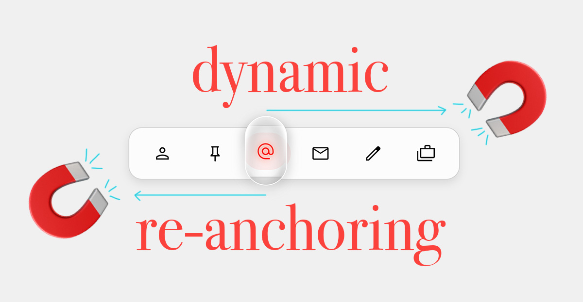
Action Bar
Let’s take a look at a more realistic demo now. You likely want to take this a step further, as a hover action is quite ephemeral and doesn’t account for other navigation modalities such as keyboard and touch.
This action bar demo combines updating the anchor on hover, focus, or selection. It creates a visual “preview” effect, like a roving focus. I’m using JavaScript here to “update” the default anchor on click, and to update the “roving” (magnifying glass 🔎) anchor on hover and focus. The rest of the styling is done in CSS.
See the Pen Follow the leader: action bar by Una Kravets (@una) on CodePen.
I think this demo shows a realistic usage of where CSS and JavaScript play really nicely together: setting state, focus, and blur in JS and applying styles in CSS.
Carousel Scroll Markers
Scroll-markers are a modern UI capability where you don’t need to add any JavaScript for the state management. This means you can achieve a real-world CSS-only usecase, leveraging :target-current to apply styles to the currently-active ::scroll-marker.
The jist of it is:
.indicator {
  position-anchor: --active-target;
}

::scroll-marker {
  transition: transform 0.2s ease;
}

::scroll-marker:target-current {
  anchor-name: --active-target;
}
And it’s a neat effect when you see it in action:
See the Pen Follow the leader: scroll markers by Una Kravets (@una) on CodePen.
I’ve got another demo here which uses this technique along with scroll-target-group to create a scroll-spy effect with a magnetic anchor, similar to the carousel above.
Conclusion
I hope you enjoyed this short blog post! This method of highlighting content on a page is just a neat little tool in my CSS toolbelt that I’ve enjoyed using lately. Shout out to Roman Komarov, who I chatted about this with at CSS Day, and who documented this technique in his early blog post on anchor positioning experiments. Let me know if you end up using it in one of your projects!