
Pure CSS Games with Counter-Increment
Published on
I really love — 1 — clever hacks and — 2 — pushing the limits of CSS. Many people don’t realize how powerful it is (especially when combined with the preprocessing prowess of Sass). This post combines those two loves. While it may or may not be something your next client will ask for, there is value in experimenting and pushing boundaries to really understand a language. You too, can make games with just CSS!
Counter-Increment #
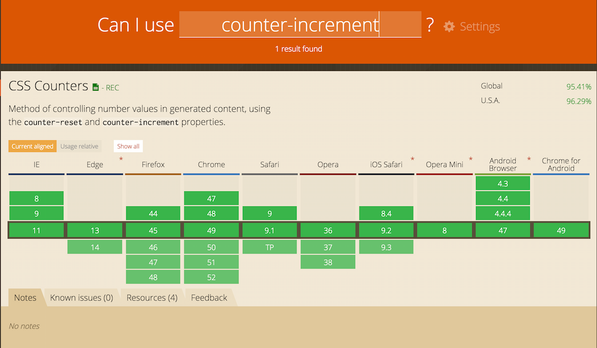
counter-increment is a relatively obscure CSS property originally intended for use for numbering outlines. This is quite practical and thus very well supported:
Counter-Reset #
In order to use counter-increment, we must first instantiate a counter on a section with counter-reset. The value for both counter-increment and counter-reset should match, but can be anything. For example:
// parent element has a counter-reset
// applied to instantiate it
section {
  counter-reset: unicornCounter;
}

// specify the child element being counted
section h1 {
  counter-increment: unicornCounter;
}
In the above code, each <h1> element inside of the section will be counted up by the value of 1 (this number can be customized, as we will cover soon).
Counting with Counter-Increment #
CSS does not provide us with many variable options (yet) or means to store numbers, but there is a little workaround: check boxes (or <input type="checkbox">)!. Check boxes have a global attribute (checked) that can be altered without any JavaScript (just by clicking). This makes it unique, and also suited for dynamic counting:
input:checked {
  counter-increment: counterName;
}
We can set the counter-increment on every input element that has the global attribute of checked (shown above) to count the number of checked checkboxes. The user dynamically adds and removes checks from this group via simple clicks, and the counter-increment responds accordingly.
Displaying Count #
To display the counter, we can use a pseudo element and the content property! Because the name of our counter is a variable that holds a counter-increment value, we can access that increment value in our CSS like so:
span::after {
  content: counter(counterName);
}
Note: It’s important to include the element which displays the counter value after the elements which you are counting in the DOM order.
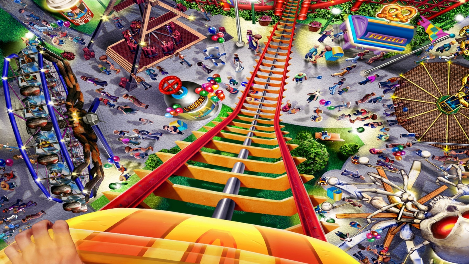
Here’s an example of a game I created using counter-increment to count how many targets were hit. Each target is a checkbox input with a randomized animation-duration applied to it to vary the speed it is moving. I also used a CSS animation with a 10 second delay to stop the game by applying an overlay once the delay timer was up. I recommend “rerunning” the pen (bottom right corner) instead of clicking “Play Again” to stay in this window:
See the Pen Pure CSS (Sass) Carnival Game by Una Kravets (@una) on CodePen.
Custom Counters #
You can also set custom counters (yes this is plural because you can use multiple counters) and specify the amount of the increment (which is 1 by default). The syntax would be as follows:
// count inputs by 2
input:checked {
  counter-increment: counterName 2;
}

// subtract 3 with each checked box
input:checked {
  counter-increment: counterName -3;
}
So if I wanted to make the game above a little more complex, I could apply a unique counter to each ring of the target:
See the Pen Multi-Point Target by Una Kravets (@una) on CodePen.
In the above case, instead of each target being an individual checkbox input, it is a list of three inputs:
<!-- HTML for target list -->
<ul class="game-area">

<!-- Individual target -->
  <ul class="target">
    <li><input type="checkbox" class="inner-check"></li>
    <li><input type="checkbox" class="middle-check"></li>
    <li><input type="checkbox" class="outer-check"></li>
  </ul>

<!-- Next targets here ... -->
</ul>
And each of those would reference the same counter (game) but apply different counter-increment values:
.inner-check {
  @extend %target-ring;
  // ... style color and position
  z-index: 3;

  // counting "game" up by 3
  &:checked {
    counter-increment: game 5;
  }

  &:checked::after {
    content: '+5';
  }
}

.middle-check {
  @extend %target-ring;
  // ... style color and position
  z-index: 2;

  // counting "game" up by 3
  &:checked {
    counter-increment: game 3;
  }

  &:checked::after {
    content: '+3';
  }
}

.outer-check {
  @extend %target-ring;
  // ... style color and position
  z-index: 1;

  // counting "game" up by 1
  &:checked {
    counter-increment: game 1;
  }

  &:checked::after {
    content: '+1';
  }
}
Checkbox Logic #
Now, you can get really crazy with this by writing some “checkbox logic” — AKA some code to check for specific patterns. You can do this by applying code based on the order of checkboxes using the :checked and :not(:checked) pseudo selectors.
For example something like :checked + :checked provides true as an attribute selector that has a checked element directly next to another checked element. :checked + :not(:checked) + :checked is true for an “on, off, on” pattern.
I used this approach to CSS logic (along with some of the animation tricks mentioned above, this time with z-index for turn-taking) to recreate a CSS-only Tic Tac Toe game. You just have to wait for the green and pink outlines to indicate a change in turns:
See the Pen Pure CSS Tic Tac Toe! by Una Kravets (@una) on CodePen.
Here is what the logic for Tic Tac Toe looks like for every case in which X can win:
// x | x | x
//   |   |
//   |   |
//
// note: also works for a horizontal match on the
// 2nd & 3rd rows, but more logic should be applied
// to avoid false positives of 3 consecutive checks
:checked + :checked + :checked ~ span::after { ... }

// x |   |
// x |   |
// x |   |
:checked + :not(:checked) + :not(:checked) + :checked + :not(:checked) + :not(:checked) + :checked ~ span::after { ... }

//   | x |
//   | x |
//   | x |
:not(:checked) + :checked + :not(:checked) + :not(:checked) + :checked + :not(:checked) + :not(:checked) + :checked ~ span::after { ... }

//   |   | x
//   |   | x
//   |   | x
:not(:checked) + :checked + :not(:checked) + :not(:checked) + :checked + :not(:checked) + :not(:checked) + :checked ~ span::after { ... }

//   |   | x
//   | x |
// x |   |
:not(:checked) + :not(:checked) + :checked + :not(:checked) + :checked + :not(:checked) + :checked ~ span::after { ... }

// x |   |
//   | x |
//   |   | x
:checked + :not(:checked) + :not(:checked) + :not(:checked) + :checked + :not(:checked) + :not(:checked) + :not(:checked)+ :checked ~ span::after { ... }
This can get complex quickly, but Sass can help out. Jake Albaugh created an absolutely incredible demo of a binary calculator using this method which really showcases how powerful it is and how helpful Sass can be. When the logic increases in complexity, you’re going to need some programming powers to help out with maintainability:
See the Pen CSS: Binary Writer by Jake Albaugh (@jakealbaugh) on CodePen.
If you make anything cool using this technique, I’d love to see it! Please share a link in the comments below: