
border-shape: the future of the non-rectangular web
Published on
Creating non-standard shapes on the web, like a speech bubble or a heart have typically required you to cut off your actual borders with clip-path. More recently, corner-shape landed in Chrome, which gives us more options for styling how a corner looks, but is still quite limited.
This is where
border-shapecomes in. It’s a powerful upcoming CSS primitive that defines a custom shape for an element’s border.
border-shape is currently available for testing in Chrome Canary 146+ with the experimental web platform features flag turned on. Part of the CSS Borders and Box Decorations Module Level 4, this property allows developers to define the geometry of an element’s border using the same flexible syntax we use for paths and shape().
All about border-shape #
Unlike clip-path, which simply masks an element, border-shape actually redefines the “box” itself. When you apply a shape to a border, the background, the border-image, focus outline, and the box-shadow all follow that new geometry.
The property accepts several values, including:
- Basic Shapes:
circle(),ellipse(),inset(), andpolygon(). - The
shape()function: A powerful new way to draw complex paths directly in CSS (in Chrome and a part of Interop 2026) - Path Strings: Similar to SVG path data (e.g.,
path("M 10 10 L 90 10 ...")).
border-shape vs. corner-shape #
While both are new and live within the same Level 4 specification, border-shape and corner-shape serve two different architectural purposes.
corner-shape doesn’t extend beyond corner styling, so you couldn’t have a cut-out or extrusion in the middle-bottom of your element, or create non-normative shapes like a star. It’s great when you want to adjust the corners to some simple, browser-provided shapes, but for more complex shapes, you’ll want to reach for border-shape.
I built a little tool to help you quickly play with it:
See the Pen Simple corner-shape visualizer by Una Kravets (@una) on CodePen.
Tooltips with border-shape #
The first thought that came to mind when I saw this API was “Amazing! we can finally do tooltips—for real!” This is a big deal! (That was not AI generated, I use em dashes my friends. I studied typography in college).
Previously, to create tooltips in CSS, you had to either cut off the edges of a div using clip-path or use the triangle hack with pseudo elements. Both have their downsides.
In this demo, I’m building a tooltip around the border using the arrow position, height, and width. It also includes the border radius in the calculation (optional). Play with the values to build your own tooltip and copy the code, with a clip-path fallback. This is why on unsupported devices, you will see the border cut off on the bottom of the tooltip. With border-shape supported, borders and shadows work as expected.
See the Pen Border-shape demo by Una Kravets (@una) on CodePen.
First set the variables:
--r: 10px;  /* Corner Radius */
--ap: 50%;  /* Arrow Position */
--ah: 10px; /* Arrow Height */
--aw: 10px; /* Arrow Width (Half) */
Then create the border-shape shape():
border-shape: shape(from var(--r) 0,
  hline to calc(100% - var(--r)),
  curve to right var(--r) with right top,
  vline to calc(100% - (var(--r) + var(--ah))),
  curve to calc(100% - var(--r)) calc(100% - var(--ah)) with right calc(100% - var(--ah)),
  hline to calc(var(--ap) + var(--aw)),
  line by calc(var(--aw) * -1) var(--ah),
  line by calc(var(--aw) * -1) calc(var(--ah) * -1),
  hline to var(--r),
  curve to left calc(100% - (var(--r) + var(--ah))) with left calc(100% - var(--ah)),
  vline to var(--r),
  curve to var(--r) top with left top);
}
Now you can take this and put it into action, like in this tooltip demo, which animates the border-shape based on its anchor position using anchored container queries:
See the Pen border-shape + anchored CQ by Una Kravets (@una) on CodePen.
Chevron nav demo #
See the Pen border-shape chevron nav styled by Una Kravets (@una) on CodePen.
This one looks a little simpler. To “type-read” this out: starting from the top-left, move to the end of the div clockwise (less the arrow size, because we then need to start drawing out to the arrow point). Then, draw a line to the center right point. Then, draw a line back to the bottom at 100% of the element less the arrow-size. Again, move all the way to the left. Finally, draw a line inward to the center at the width of the arrow size, and close it.
border-shape: shape(
  from top left,
  hline to calc(100% - var(--arrow-size)),
  line to right center,
  line to calc(100% - var(--arrow-size)) bottom,
  hline to left,
  line to var(--arrow-size) center,
  close
);
The first element has a slight adjustment where I just removed the line before the close instead of adding the inset chevron of the last step above.
border-shape: shape(
  from top left,
  hline to calc(100% - var(--arrow-size)),
  line to right center,
  line to calc(100% - var(--arrow-size)) bottom,
  hline to left,
  close
);
This demo is really neat because you can add a gap and really see how this works. No need to mess with z-index, no layering, and borders/outlines will follow the border-shape perfectly. Just real geometry. Pretty cool!
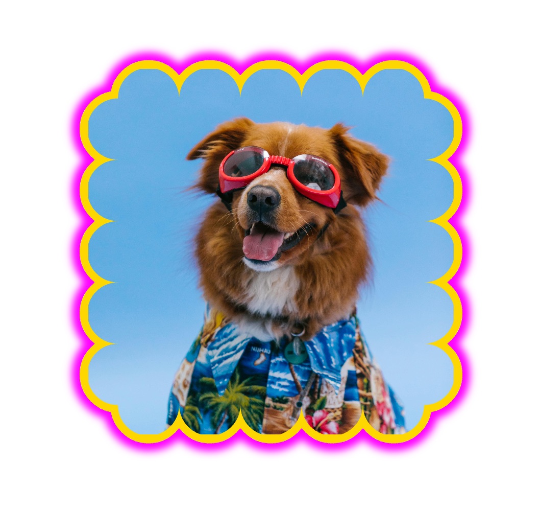
Scalloped Borders #
Next, I wanted to explore more complex borders like this scalloped border. This is one of the first Houdini demos I built back in the day. This one is a bunch of arcs going clockwise.
border-shape: shape(
    from 0% 0%,

    /* TOP EDGE: Moving +X */
    arc by 20% 0% of 10% 10% small cw,
    arc by 20% 0% of 10% 10% small cw,
    arc by 20% 0% of 10% 10% small cw,
    arc by 20% 0% of 10% 10% small cw,
    arc by 20% 0% of 10% 10% small cw,

    /* RIGHT EDGE: Moving +Y */
    arc by 0% 20% of 10% 10% small cw,
    arc by 0% 20% of 10% 10% small cw,
    arc by 0% 20% of 10% 10% small cw,
    arc by 0% 20% of 10% 10% small cw,
    arc by 0% 20% of 10% 10% small cw,

    /* etc... */

    close
  ) content-box;
You may have noticed a new keyword there content-box, which specifies that you’re using all of the coordinated and percentages relative to the element’s content-area inside of its padding. So in this example, you will always have 5 scallops which are 20% of the width or height (depending on direction). You also need to make sure the padding is wide enough to cover the edges, though there is an open issue about how this should behave.
Wrap up #
border-shape is a really big change to geometry on the web platform, and experimenting with this capability is a lot of fun! I think it’s a game-changer for the non-rectangular web.
To experiment with it now, you’ll need to be in the latest Chrome Canary with the Experimental Web Platform Features flag enabled (chrome://flags/#enable-experimental-web-platform-features).