
CSS Image Effects #1: Vintage Washout
Published on
Last week, I gave a talk at CSS Conf EU called PS is Dead!: Editing Photos in CSS. My original idea was to outline 10 things you traditionally used Photoshop for that you can now just do in the browser, but when I started to look into filter effects and blend modes there was just so much to explore! I showed a few of those effects in the talk, and now I’m going to write a series of posts to split it into more digestible and sharable bits. Let’s start with something simple and effective!
The Washout Effect
This effect is something we often see in filters trying to get a vintage feel. What happens is that the darkest shade is lightened and the detail in the shadows is lost (washing out the darker details). It appears as a lower contrast because the color (and thus) luminosity range is being limited.
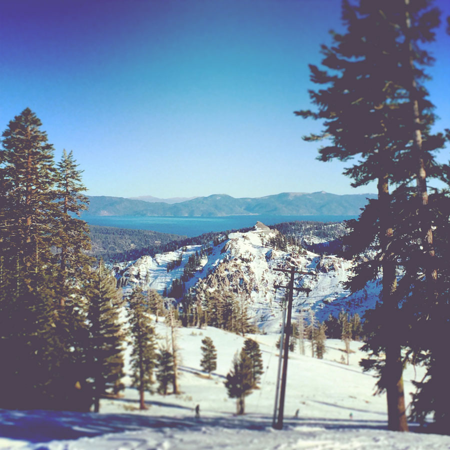
What is happening here is that we are replacing the dark tones with a slightly lighter shade. If the existing tone is darker than the “new” darkest tone, it is simply overridden by that tone. Thus, the lighten blend mode is perfect for our needs here.
Step 1: Blend-Mode: Lighten
We apply the lighten blend mode to either an overlapping element or a pseudo element. You can use background-blend-mode: lighten on an element with multiple blend modes, or mix-blend-mode: lighten on the overlapping element. However, I’d recommend multiple backgrounds for this (see Application section).
Please note: the <img> element cannot have its own pseudo elements like :before and :after.
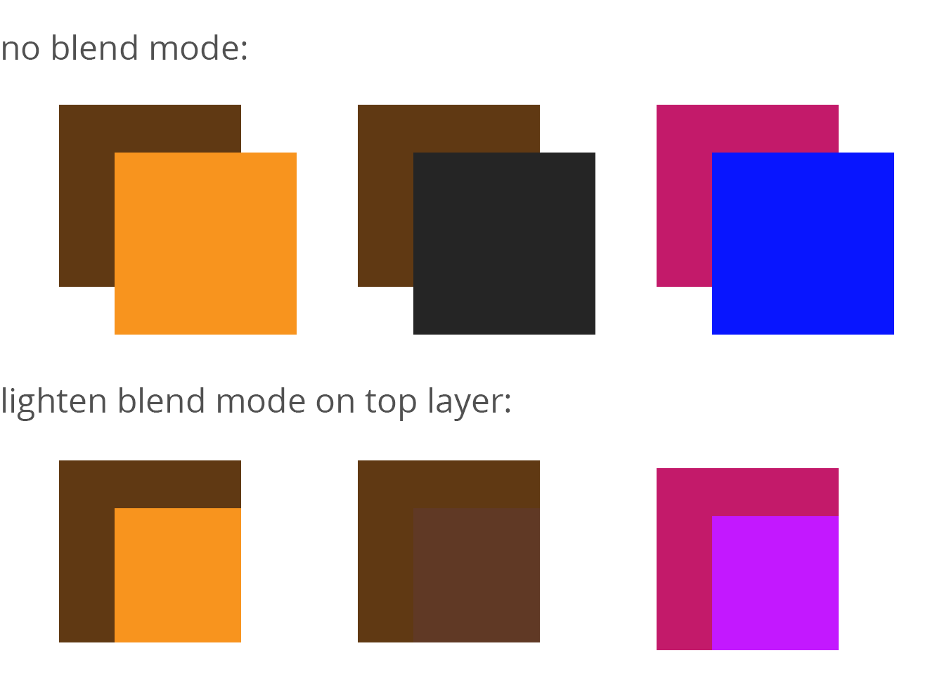
With the lighten blend mode, the lightness of the pixels (brightness value) is determined between overlapping pixels on every RGB channel and the pixel with the darker luminosity has its tone and hue overriden by the lighter one. If a bright orange overlapped a dark brown, for instance, the pixels would become orange since every channel is lighter. When we mix tones we get a new color from the lightest selected RGB tonality per channel.
A background shade of: rgb(195, 25, 106) //deep pink lightened by: rgb(6, 19, 255) //blue becomes: rgb(195, 25, 255) //magenta because it is taking the red and green value from the first number and the blue value from the last one. Here is a visual:
Step 2: Determine Darkest Color
We can use this feature to then determine what we want to set as the darkest possible value on the image, therefore eliminating any detail in darker elements and creating that subdued effect. For instance, if we choose our dark shade to be a dimgrey, any pixels darker than dimgrey will become dimgrey, while any pixels lighter than it will remain.
Choosing a dark purple or brown color will likely get you the effect you are looking for.
Application
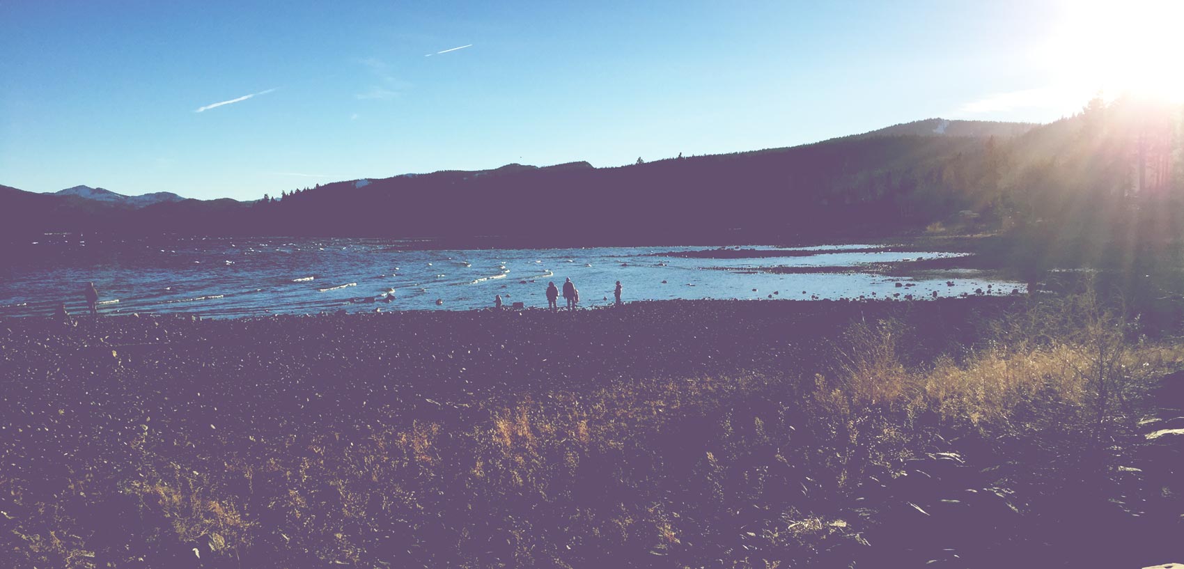
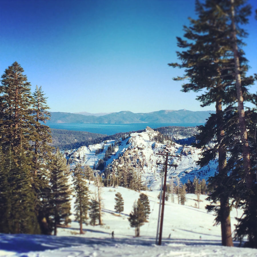
The best way to apply this effect is via multiple backgrounds right now. This is because not every browser supports blend modes yet. If you use multiple backgrounds, the top image will show regardless and the lightened second background will appear if they are supported as progressive enhancement. Here is a live example:
@Mixin For the Win
Okay, so that’s cool and all, but we can make it even easier to apply with a @mixin!
@mixin fade-it($img, $shadow: #536) { background: url('#{$img}'), $shadow; background-blend-mode: lighten; }.apply-base { @include fade-it(‘1.jpg’); }
.apply-unique-shade { @include fade-it(‘2.jpg’, #293e78); }
.apply-base {
  background: url('1.jpg'), #536;
  background-blend-mode: lighten;
}

.apply-unique-shade {
  background: url('2.jpg'), #293e78;
  background-blend-mode: lighten;
}
tldr; vintage washout effect = lighten blend mode + element with a background that is the shadow color
For further reading, this article is an excellent resource on how blend modes work.
{% include css-effects.html %}