
Sass Pixel Art
Published on
It is 6:37 AM and I am at an airport. This is where to best ideas happen right? I’ve been perusing the Internet to find some practical examples of Sass lists using list functions in production (somewhat unsuccessfully) and stumbled upon this really awesome CodePen by @shadowmint and @jackarmley. Hmm. Just the thing I needed for in-flight entertainment for the duration of the trip. I wanted to get down to nitty gritty and understand what was happening here.
The first time I saw Sass read from a matrix for dynamic instruction was in Roy Tomeij’s SassConf 2013 workshop and it went right over my head. But I get it now. And I was able to cover this topic in my own Advanced Sass workshop for PEERS Conf!
Box Shadow Pixels #
So let’s get started. What exactly is making those little pixels? If the title didn’t give it away, it’s the CSS3 multiple box shadow property. Each pixel is it’s own, individually placed box shadow. These are strung together via a comma-separated list. You can have as many box-shadows as you want on a div. Pretty cool.
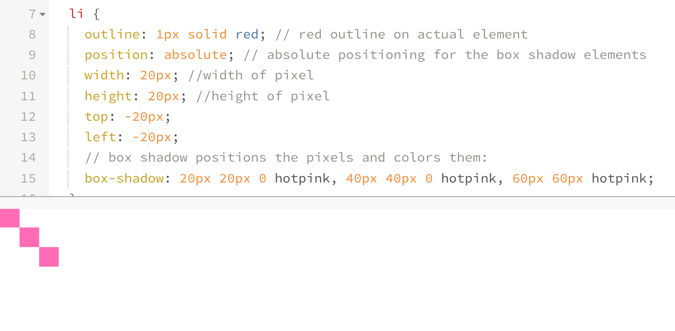
Your box shadow will always be behind your element, so you’ll need to start positioning it at ($pixel-size, $pixel-size) rather than (0,0). Here is a visual example, where our actual div is outlined in red and our box shadows are a hotpink box:
We lose one of our pixels. We can mitigate this by starting the positioning at ($pixel-size, $pixel-size). Then, we can fix the positioning of this element by making it absolutely positioned within a relatively positioned element and shifting it to the point (-$pixel-size, -$pixel-size):
Sass Data Type Functions #
As an Almost-Turing-Complete-Programming-Language, the organizational structures and data types that Sass provides us with are pretty darn powerful. These include maps, which you can nest, and lists, which you can use within maps. Sass also inherently provides us with a really nice set of functions to access and manipulate items from such structures. Let’s start by looking at list functions, as sourced from the SassScript documentation:
List Functions: #
length($list): Returns the length of a list.nth($list, $n): Returns a specific item in a list at the nth value.set-nth($list, $n, $value): Replaces the nth item in a list.join($list1, $list2): Joins together two lists into one.append($list1, $val): Appends a value onto the end of a list.zip($lists…): Combines lists into a single multidimensional list.index($list, $value): Returns the position of a value within a list. (You can also use this to determine if a value exists within a list)list-separator(#list): Returns the separator of a list.
Reading a Matrix #
Okay, so now that we have a baseline on the types of things we can do with Sass’ data types, let’s manipulate them. The matrix that we will be referring to isn’t a matrix data type, but a list that looks a little bit like this:
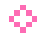
// this is a diamond:
(o o x o o)
(o x o x o)
(x o o o x)
(o x o x o)
(o o x o o)
It’s really just a glorified space-separated list of space-separated lists within parenthesis (#meta). So how are the pixels being created? We can loop through this list and check the value of each item in the list to build a new list based on some information from it. We’re essentially mapping each pixel value (item in the original list) with an output function (a box shadow will be generated). This sounds confusing, but let me try to break it down:
- Determine size/color of the pixels
- Create an empty list for box shadows to be filled with incoming data
- Itemize each row to set a y-value (vertical position in the matrix grid)
- Read the n-value (horizontal position in the list) to determine it’s x-value
- Determine the y-value of that pixel based on its row
- Read the actual letter (content-value) to determine the color of the pixel
- Append determined values to box-shadow list, ending with
, - Loop through steps 4-7 for the entire matrix grid
Building the Pixel Grid #
We’re setting some defaults here and starting with a binary color value option for our pixels (either on or off. If on, it will be the determined color in the function). Using hotpink as our default color and 10px as our pixel-size, we can write a function called pixelize to read the matrix:
@function pixelize($matrix, $size: 10px, $color: hotpink) {
  $l: length($matrix); // length of the entire
  $shadows: ''; // shadows list section
  $i: $l; // length of the line on a matrix

// read through the all the rows of the list
  @for $i from 1 through $l {
    $row: nth($matrix, $i); // this is a single row

    @for $j from 1 through length($row){
        $item: nth($row, $j); //itemize each element in that row

// if that item is an x, give it a drop shadow square w/background color (this is where we're building the shadows list)
        @if $item == x{
          $shadows:  $shadows + ($j*$size) + ' ' + ($i*$size) + ' ' + $color;
        } @else{
          $shadows:  $shadows + ($j*$size) + ' ' + ($i*$size) + ' ' + transparent;
        }

// when you get to the end of the row, add a comma before the next block of drpo shadows
      @if not ($j == length($row) and $i == $l) {
        $shadows: $shadows + ',';
      }
    }
  }

// return the entire shadow list here
  @return unquote($shadows);
}
Our $shadows list ends up looking like this:
10px 10px transparent,20px 10px transparent,30px 10px hotpink,40px 10px transparent,50px 10px transparent,10px 20px transparent,20px 20px hotpink,30px 20px transparent,40px 20px hotpink,50px 20px transparent,10px 30px hotpink,20px 30px transparent,30px 30px transparent,40px 30px transparent,50px 30px hotpink,10px 40px transparent,20px 40px hotpink,30px 40px transparent,40px 40px hotpink,50px 40px transparent,10px 50px transparent,20px 50px transparent,30px 50px hotpink,40px 50px transparent,50px 50px transparentIf we break down that output, looks like this:
// top row
10px 10px transparent,
20px 10px transparent,
30px 10px hotpink,
40px 10px transparent,
50px 10px transparent,

//second row
10px 20px transparent,
20px 20px hotpink,
30px 20px transparent,
40px 20px hotpink,
50px 20px transparent,

// 3rd row
10px 30px hotpink,
20px 30px transparent,
30px 30px transparent,
40px 30px transparent,
50px 30px hotpink,

// 4th row
10px 40px transparent,
20px 40px hotpink,
30px 40px transparent,
40px 40px hotpink,
50px 40px transparent,

//bottom row
10px 50px transparent,
20px 50px transparent,
30px 50px hotpink,
40px 50px transparent,
50px 50px transparent;
And these are exactly the values we want to create as our box-shadows. The first value of each box-shadow is the position based on the nth-value * $pixel-size in the row. The second value is the the column * $pixel-size. And the old-third value is the $color of the pixel determined by the content of that particular item. To create pixels with this function, we’d simply use: box-shadow: pixelize($var).
Since we’re building a list and using these box shadows as :after content, the full usage may look something like this for placement:
// HTML:
//  <ul class="icons">
//    <li class="icons--diamond"></li>
//  </ul>

// icon matrix we're reading through
$diamond: (o o x o o)
          (o x o x o)
          (x o o o x)
          (o x o x o)
          (o o x o o);

// list we're styling
.icons{
  margin: 3em auto;
  padding: 0;
  width: 100%;
  list-style: none;
  text-align: center;

  li {
    margin: 1em;
    display: inline-block;
    position: relative;

  }

  &--diamond {
    &:after {
      content: '';
      position: absolute;
      top: -$icon-size-var;
      left: -$icon-size-var;
      width: $icon-size-var;
      height: $icon-size-var;
      box-shadow: pixelize($diamond);
    }
  }
}
And our result:
We’re positioning the item in the list and calling: box-shadow: pixelize($diamond). If we wanted to specify the size and color, we could do something like: box-shadow: pixelize($diamond, 15px, #f00).
Colormapping Pixels #
We can also use this same technique to get a bit more advanced. Let’s make the mushroom from Mario! First step is to figure out the grid:

Then, we can use these numbers and color values to make some colored pixel art. Let’s use w for white, r for red, k for black, and o for transparent pixels. With that setup, we can turn the Mario mushroom into a matrix of pixel values:
(o o o o o k k k k k k o o o o o)
(o o o k k r r r r w w k k o o o)
(o o k w w r r r r w w w w k o o)
(o k w w r r r r r r w w w w k o)
(o k w r r w w w w r r w w w k o)
(k r r r w w w w w w r r r r r k)
(k r r r w w w w w w r r w w r k)
(k w r r w w w w w w r w w w w k)
(k w w r r w w w w r r w w w w k)
(k w w r r r r r r r r r w w r k)
(k w r r k k k k k k k k r r r k)
(o k k k w w k w w k w w k k k o)
(o o k w w w k w w k w w w k o o)
(o o k w w w w w w w w w w k o o)
(o o o k w w w w w w w w k o o o)
(o o o o k k k k k k k k o o o o)
Now, when we read the lines, we want to adjust for each of these colors:
@if $item == w{
  $sh:  $sh + ($j*$size) + ' ' + ($i*$size) + ' ' + white;
}
@if $item == k {
  $sh:  $sh + ($j*$size) + ' ' + ($i*$size) + ' ' + black;
}
@if $item == r {
  $sh:  $sh + ($j*$size) + ' ' + ($i*$size) + ' ' + red;
}
@if $item == o {
  $sh:  $sh + ($j*$size) + ' ' + ($i*$size) + ' ' + transparent;
}
We can make this a little bit more modular by abstracting the pixel color variables into a property map and access that to make sure things remain modular and neatly organized:
// map of pixel mapping color values to actual color
$pixel-color-map: (
  'r' : #f00,
  'w': #fff,
  'k': #000,
  'o': transparent
);

// using the map in our mixin
@if $item == 'w' {
  $sh:  $sh + ($j*$size) + ' ' + ($i*$size) + ' ' + map-get($pixel-color-map, 'w');
}
@if $item == 'k' {
  $sh:  $sh + ($j*$size) + ' ' + ($i*$size) + ' ' + map-get($pixel-color-map, 'k');
}
@if $item == 'r' {
  $sh:  $sh + ($j*$size) + ' ' + ($i*$size) + ' ' + map-get($pixel-color-map, 'r');
}
@if $item == 'o' {
  $sh:  $sh + ($j*$size) + ' ' + ($i*$size) + ' ' + map-get($pixel-color-map, 'o');
}
But we can surely clean that up to make a bit more DRY, right? Let’s check to see if our value exists in our map, and then sync it up with it’s matching value:
@if map-has-key($pixel-color-map, $item) {
  $sh:  $sh + ($j*$size) + ' ' + ($i*$size) + ' ' + map-get($pixel-color-map, $item);
}
We’ll also want to add a warning with @warn as a safeguard to explain why something may have gone wrong or to remind us to define a color variable mapped to a pixel letter:
@if map-has-key($pixel-color-map, $item) {
  $sh:  $sh + ($j*$size) + ' ' + ($i*$size) + ' ' + map-get($pixel-color-map, $item);
} @else {
  @warn 'there is no color specified in "$pixel-color-map" for: "#{$item}"';
}
To improve this further, Ana Tudor suggested using the following to skip over pixels mapped to o or transparent: We would need to instantiate $sh as a real list with $sh: (); instead of string $sh: " ":
@if map-has-key($pixel-color-map, $item) and $item !='o' {
  $sh:  $sh, ($j*$size) ($i*$size) map-get($pixel-color-map, $item);
} @else {
  @warn 'there is no color specified in "$pixel-color-map" for: "#{$item}"';
}
This eliminates transparent box shadows and makes the file size of our output smaller.
Maps and Mixins #
Let’s do a few more pixelized arts! We can make this even more fun and DRY via a mixin to run through a map of pixel-mapped art. All list functions also work for maps. Sass treats them as lists of pairs. It also comes with some additional map functions.
Map Functions: #
map-get($map, $key): Returns the value in a map associated with a given key.map-merge($map1, $map2): Merges two maps together into a new map.map-remove($map, $keys…): Returns a new map with keys removed.map-keys($map): Returns a list of all keys in a map.map-values($map): Returns a list of all values in a map.map-has-key($map, $key): Returns whether a map has a value associated with a given key.keywords($args): Returns the keywords passed to a function that takes variable arguments.
I’m going to make a few more Mario pixel art elements, so I’m expanding my color pallet and I’m going to put them all in a map. Then I’ll just write a mixin to read the map and create the pixel art! Because we’re dynamically determining size via length of the $row, we can mix and match matrix grid sizes. Here’s that map:
$pixel-art:(
  mushroom: (
    (o o o o o k k k k k k o o o o o)
    (o o o k k r r r r w w k k o o o)
    (o o k w w r r r r w w w w k o o)
    (o k w w r r r r r r w w w w k o)
    (o k w r r w w w w r r w w w k o)
    (k r r r w w w w w w r r r r r k)
    (k r r r w w w w w w r r w w r k)
    (k w r r w w w w w w r w w w w k)
    (k w w r r w w w w r r w w w w k)
    (k w w r r r r r r r r r w w r k)
    (k w r r k k k k k k k k r r r k)
    (o k k k w w k w w k w w k k k o)
    (o o k w w w k w w k w w w k o o)
    (o o k w w w w w w w w w w k o o)
    (o o o k w w w w w w w w k o o o)
    (o o o o k k k k k k k k o o o o)
  ),

  mario: (
    (o o o r r r r r r o o o o)
    (o o r r r r r r r r r r o)
    (o o t t t p p p k p o o o)
    (o t p t p p p p k p p p o)
    (o t p t t p p p p k p p p)
    (o t t p p p p p k k k k o)
    (o o o p p p p p p p p o o)
    (o o r r b r r r r o o o o)
    (o r r r b r r b r r r r o)
    (r r r r b b b b r r r r o)
    (p p r b y b b y b r p p o)
    (p p p b b b b b b p p p o)
    (p p b b b b b b b b p p o)
    (o o b b b o o b b b o o o)
    (o t t t o o o o t t t o o)
    (t t t t o o o o t t t t o)
  ),
  star: (
    (o o o o o o o k k o o o o o o o)
    (o o o o o o k y y k o o o o o o)
    (o o o o o o k y y k o o o o o o)
    (o o o o o k y y y y k o o o o o)
    (k k k k k k y y y y k k k k k k)
    (k y y y y y y y y y y y y y y k)
    (o k y y y y k y y k y y y y k o)
    (o o k y y y k y y k y y y k o o)
    (o o o k y y k y y k y y k o o o)
    (o o o k y y y y y y y y k o o o)
    (o o k y y y y y y y y y y k o o)
    (o o k y y y y y y y y y y k o o)
    (o k y y y y y k k y y y y y k o)
    (o k y y y k k o o k k y y y k o)
    (k y y k k o o o o o o k k y y k)
    (k k k o o o o o o o o o o k k k)
  )
);
You can use anything to denote colors (letters, numbers, words) but I recommend sticking to single character strings because it helps to visually represent pixels by keeping them all mono-spaced.
So now, let’s write a mixin that will read that map and generate the styling for our elements by running the function. We won’t be setting the color as being the same for each pixel this time, so we only need to provide the name of the pixel-art we’re styling ($matrix) and the size of each pixel ($size), which we can set a default for if we want.
@mixin style-item($matrix, $size){
position: relative;
// set width & height of icon based on size of pixels
width:($size * length(nth($matrix,1)));
height:($size * length($matrix));
&:after{
content: '';
// position everything from the top left corner
position: absolute;
top: (-$size);
left: (-$size);
width: $size;
height: $size;
box-shadow: pixelize($matrix,$size);
}
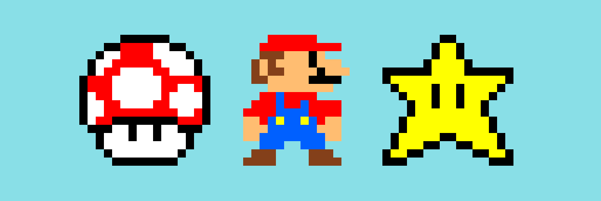
}So now that we have that mixin, we can loop through our map of Mario $pixel-art and generate some styled classes:
// HTML:
// <ul class="mario-art">
//   <li class="mario-art--mushroom"></li>
//   <li class="mario-art--mario"></li>
//   <li class="mario-art--star"></li>
// </ul>

.mario-art{
  list-style: none;

  @each $key, $value in $pixel-art{
    &--#{$key}{
      @include style-item($value, $icon-size);
    }
  }
}
When you apply a background color so that we can see the transparent vs. white pixels, it looks a little something like this:
There are lots of fun things you can do with this. For example, you can add a border-radius argument to your mixin to round out the pixels. border-radius: 50% on the :after element will give you rounded pixels, while anything less will round slightly. Go crazy and have fun :)

Bam! It’s Sass magicery! Make sure to check out the live demo in CodePen:
See the Pen Sass-Generated Box Shadow Pixel Art! by Una Kravets (@unax3) on CodePen.
P.S. oh my gosh, please never actually use this in production. It’s terrible for performance, but it’s great to just play around with :)