
CSS Image Effects #5: Lomography
Published on
This is part of a series of posts breaking down visual effects using CSS filters and blend modes. Read Part 1: The Vintage Washout Effect, Part 2: 3d Glasses, Part 3: Vignettes, and Part 4: Bokeh Textures for some background on blend modes and filters. In this post we’ll explore a relatively new photography technique founded in Austria in the early 90’s, called Lomography.
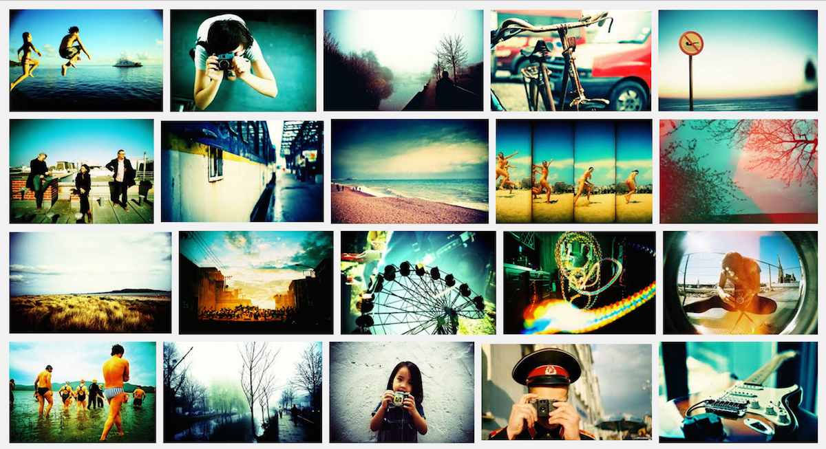
A Little Background on Lomography #
Lomography (AKA Lomo) was based on and inspired by a cheap Russian toy camera, the Lomo LC-A. These photos are often high contrast with vignettes and soft focus. The original lomo cameras are the LC-A, Holga, Fisheye, Colorsplash and Supersampler 1. These cameras were originally considered “low quality” and created distorted images.
So, Lomography is very saturated, sometimes blurred, and contains unexpected light leaks. Hmm.. these all sound suspiciously like things we can do in CSS!
Playing with Filters #
A common trait in Lomography is vibrant, saturated colors. We can easily tackle this with CSS filters. So, let’s turn our filter: saturate() contrast() game up.
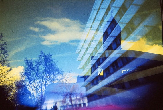
Following Lomography principles of not over-thinking image composition and capturing real life, I may or may not have taken this sample photo in the bathroom of the coffee shop from which I am writing this post. With a little bit of saturation and contrast (and a hue-rotate, because, “why not?”), it already looks much more vibrant and Lomo.
Original Image
filter: saturate(1.5) contrast(1.5) hue-rotate(-15deg);
Blur within the lines #
Blur is another common feature in Lomography. We can use the blur() filter in CSS to achieve this effect. Blur accepts any unit value (em, px, pt, rem, etc.) but you’ll probably want to keep the blur very gentle and light for this effect. Less than 1px should be fine, but to represent what’s happening here, I will use 5px.

If we just apply filter: blur(5px) to an image, the borders also blur, as you can see in this image to the left. To prevent this, we’ll want to wrap that image in a <figure> element:
<figure>
  <img src="yummy.jpg"/>
</figure>
Once we’ve done that, we can position the <img> within that <figure> to prevent blurry overflow:
img {
  filter: blur(5px);
  /* image is wider than
  // figure to compensate
  // for the blur: */
  width: 102%;
  margin: -1%;
}
figure {
overflow: hidden;
/* desired image size: */
max-width: 300px;
}
Let’s see what filter: blur(.5px) looks like with our original image (in addition to the other filters applied):
Light Leaks #
Things can get really fun with colored light leaks — and CSS gradients are the perfect vessel with which to create them! I would recommend checking out some of my earlier posts from this series and also this article for an overview of gradient positioning.
I decided to use some yellow and hotpink circles which look like this:
The really useful thing about gradients is that you can specify their size and position, as well as apply an unlimited number of them. (Note: watch out for performance concerns when using many CSS gradients).
In the example, I am using two gradients within a pseudo-element background. Note: I’m using rgba(255,255,255,0) instead of just using the keyword transparent because there are rendering problems with transparent on some browsers, where they interpret it as rgba(0,0,0,0), causing dark circles to appear as the gradient attempts to blend black transparent instead of white transparent with the other colors specified 2.
background:
  radial-gradient(500px circle at 30% 10%, yellow, rgba(255,255,255,0)),
  radial-gradient(300px circle at 80% 60%, deeppink, rgba(255,255,255,0));
When we apply the background above with a mix-blend-mode: overlay to our sample image, it looks pretty cool:
Here’s the same effect on another image I randomly took in this place:
Double Exposure #
Another popular Lomography technique is double-exposing images (overlaying them on top of each other). This would happen with film if you shot the roll and then (usually by mistake) kept shooting photographs on it, causing you to create two images on the spot in the reel.
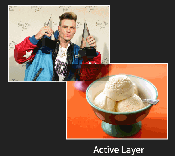
Image taken from my talk on CSS Image Effects.
This effect is super easy to create with blend modes, particularly the multiply blend mode, which works pretty similarly to transparencies. In this gif, the multiply blend mode is being applied to the image of vanilla ice cream — overlaid like a transparency on top of the image of vanilla ice. The lighter pixels (by luminosity) become transparent, and the darker pixels are overlaid.
But multiply isn’t the only blend mode that works here! Let’s see what happens when we double-expose our test images with overlay and tone down the saturation a bit:
Okay, so maybe there's still way too much craziness going on in there, but you get the idea.
Mixing Styles #
Here’s a better example. Remember the post about Anaglyphs from a little while back? Well when I was playing around with some of these effects when writing that post, and made a little “mistake” that I loved so much that I called it “Accidental Cool Effect 2.” And now I’m sharing it:
See the Pen Accidental cool effect 2 by Una Kravets (@una) on CodePen.
Messing around with color, image layering, and blend modes unabashedly is quiet honestly the best way to stumble upon interesting image effects. Within the browser, it’s really quick and easy to do this! I use Google Chrome Developer Tools a lot to discover interesting combinations, which allow me to see the changes in real time and help guide decisions (which are difficult to pin down when there are so many different ways to get a nice Lomography effect). Some notable Dev Tools features for this type of experimentation include the ability to pick color from the page and color palettes:
<img class=“old-half—left”src=“/posts/css-effects/5/devtools-colorpicker.jpg”> <img class=“old-right—left”src=“/posts/css-effects/5/devtools-palettes.png”>
I highly recommend having the Developer Tools panel open while playing around with image effects because you never know what happy accidents will happen!
tl;dr: Lomography effects can be achieved in browser with a mixture of techniques.
{% include css-effects.html %}