
Classy CSS: a Programmatic Approach to Sass Stylesheets
Published on
I began writing this blog post a few weeks after releasing a semi-satirical article about my take on the mix of current CSS naming convention/styling trends on Sitepoint called Atomic OOBEMITSCSS. That was back in August, but life got in the way. I called it Atomic OOBEMITSCSS as a joke, but people started picking up the name and using it in the wild (which was honestly pretty entertaining as questions about it sprung up in-person). Debate over using @extend at SassConf this year (and on Twitter lately) reminded me about revisiting this idea.
Classy CSS, Please. #
In the article mentioned above (Atomic OOBEMITSCSS), I explain how I mark up components (via an example using Pinterest) and correlate their styling. I still use that post as a handy manual for people around me who ask about our front-end architecture, which has since been stress-tested on a large-scale pattern library.

Consequently, I have found myself needing to explain the system (and Sass itself) to people with traditional computer science backgrounds. Doing so made me realize just how programmatic and class-based the CSS architecture system I described in the article was. So I’d like to take a moment to give it a legitimate name that I can actually get behind, Classy CSS, and to also explain it in a way that a traditional programmer may find a bit closer to home.
This post has three goals:
- To defend
@extend - To introduce Classy CSS (much easier to pronounce than Atomic OOBEMITSCSS)
- To explain a scalable, modular, and class-based approach to CSS
A Classy Button #
I’ll go into a little bit more depth with how it works here, using a button as my example (because the button is the “hello world” of CSS):
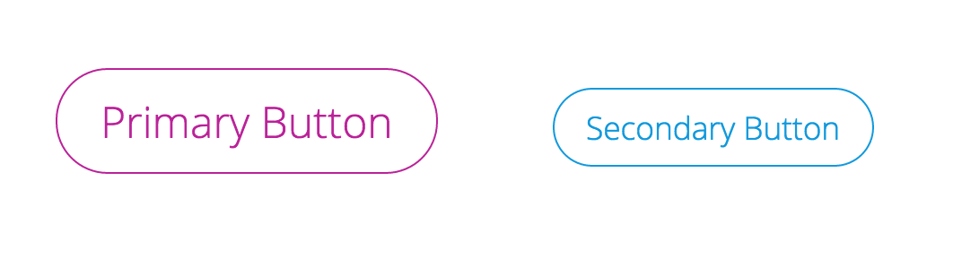
We start with a silent placeholder selector with the base code for every single button, using a modified BEM-like syntax. The first part of its naming is going to be the object we’re referencing (button or btn) and after a double dash, we have the modifier (base in this case). Note: variables are named in the same way — the type of variable being the base (color in the case of the below example).
$color--primary: #b29;
$color--secondary: #19d;

%btn--base {
  border: 1px solid currentColor;
  border-radius: 1.5em;
  background: none;
  outline: none;
  transition-duration: .25s;
  cursor: pointer;
  margin: 30px;
  padding: .5em 1em;

  &:hover {
    color: white;
    background: black;
  }
}
This base button is our button class. We will be building on top of this for every button, as every button is an instance of that class. Every button element has the type button, and thus shares some common traits (solid outline, transparent background, etc.). Every button pulls from the same common properties and builds on top of them. They do not overwrite, but add onto those properties. They are all buttons++ and inherit from the base button. (was that enough ways to say the same thing?)
%btn--primary {
  @extend %btn--base;
  color: $color--primary;
  font-size: 1.5em;
}

%btn--secondary {
  @extend %btn--base;
  color: $color--secondary;
  font-size: 1.1em;
}
usage here:
.hero__btn {
  @extend %btn--primary;
  margin: 2em;
}

.sidebar__btn {
  @extend %btn--secondary
}

.global-nav__btn--login {
  @extend %btn--secondary;
  margin-right: 1em;
}
If you’re writing those in the classy way, each component (hero, sidebar, global-nav) would have its own partial .scss file where the classes are being instantiated for real use. That could look something like:
_hero.scss
.hero {

  ...

  &__btn {
    @extend %btn--primary;
  }

  ...

}
_sidebar.scss
.sidebar {

  ...

  &__btn {
    @extend %btn--secondary;
  }

  ...

}
_global-nav.scss
.global-nav {

    ...

    &__btn {
      @extend %btn--secondary;

      &--login {
        @extend .global-nav__btn;
        margin-right: 1em;
        // at this point, you're
        // styling .global-nav__btn--login
    }
  }
}
Well, What About Mixins? #
You may be wondering, well why not use a @mixin instead? In the way that we’re breaking up these classes, the purpose and concept of using @extend makes more sense. You can create mixins within the placeholder classes we are extending from to build out styles, and then use @extend to instantiate those into classes.
In Defense of @extend #
Using @extend allows a smaller output CSS file and cleaner code if you understand what is going on (we’re appending styles instead of duplicating them). You can argue that this isn’t a concern with gzip compression, but you can’t always ensure gzip compression unless you have access to server configuration settings.
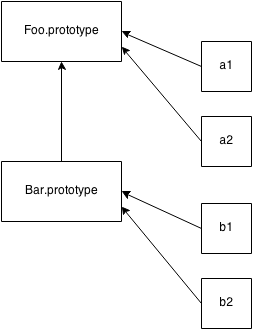
To understand and use @extend effectively, it’s really important to understand exactly what’s “going on” and the underlying differences between @mixin vs. @extend. Here is a visual:
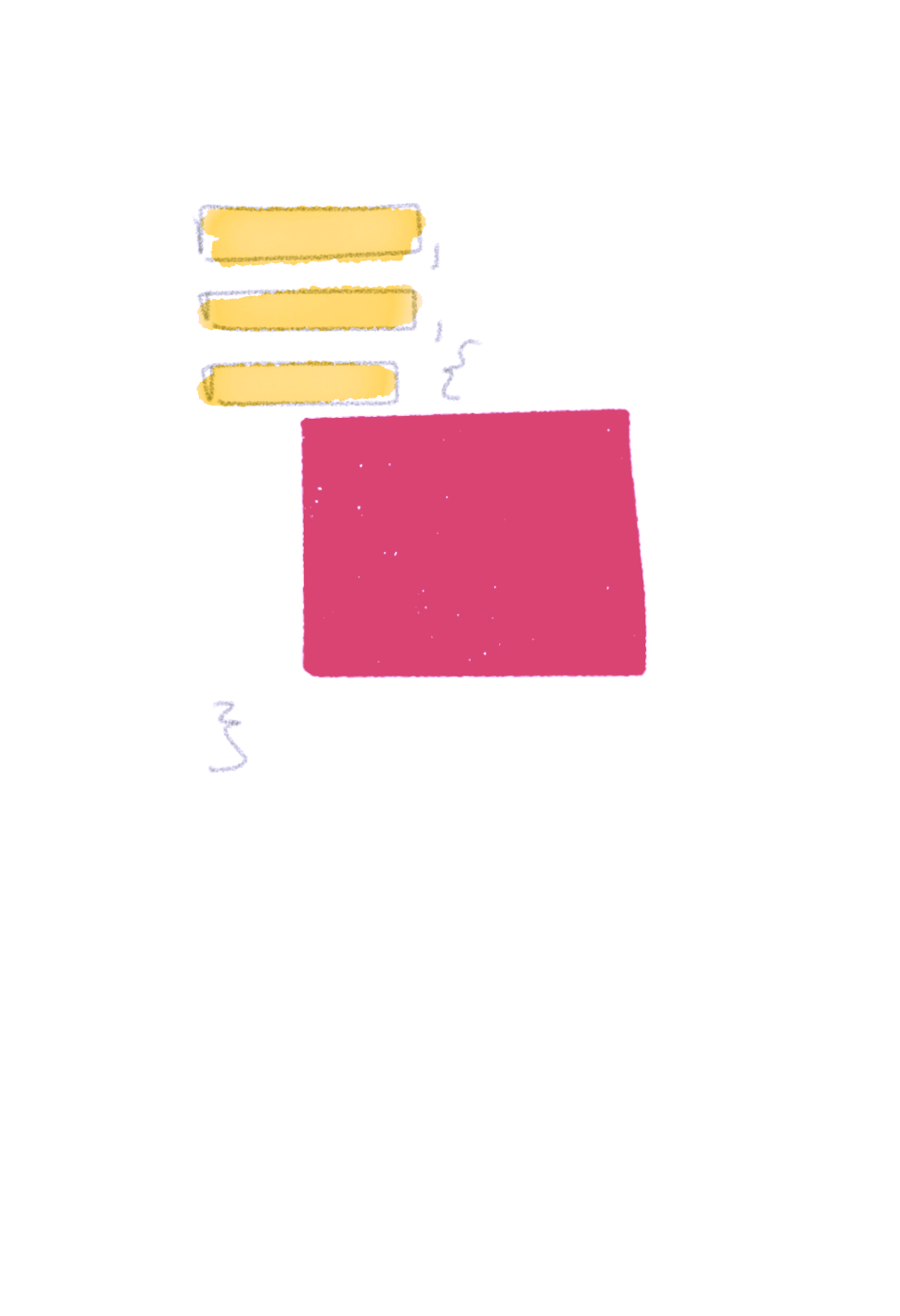
A
@mixinis like a stamp: it creates a duplicated version of the property block (optionally) with arguments provided. An@extendappends the element you are extending to the property block. It is your “yes, and ___” statement.
This means that we have a smaller output CSS file because we are not reproducing the code block each time we are implementing it. The @extend simply allows us to reference the properties. Extends are so perfect for this! Their logical purpose makes sense. #teamExtend
The downside of this is that we have no control over where the block of properties lives since we are not invoking a new instance of that code block within the property, simply referencing it to pull styles from (which is why you can’t use @extend within media queries). But this doesn’t matter if we are following principles of Classy CSS. You extend silent placeholders into actual, usable classes to instantiate them, and @mixins are reserved for a different purpose. They are used inside of the silent placeholders to build the code which is then extended.
In the case of Classy CSS, mixins are like constructors and you only use them within silent placeholder selectors.
For instance, lets make a button mixin to make primary and secondary buttons easier to build out:
// the colon after the argument denotes a default value
// creating the constructor function (mixin)

@mixin btn-me($color: hotpink, $size: normal) {
  border: 1px solid $color;
  border-radius: 1.5em;
  background: none;
  outline: none;
  transition-duration: .25s;
  cursor: pointer;
  margin: 30px;
  padding: .5em 1em;

  @if $size == 'small' {
    font-size: .8em;
  } @else {
    font-size: 1.2em;
  }

  &:hover {
    color: white;
    background: $color;
  }
}

// creating placeholder classes to extend from and reference

%btn--primary {
  @include btn-me; // no arguments means it takes defaults
}

%btn--secondary {
  @include btn-me(blue, small)
}

// instantiating the code with semantic naming
// this is the only moment that we are writing
// any code to be compiled
.hero__btn {
  @extend %btn--secondary;
}
And the CSS output looks like:
.hero__btn {
  border: 1px solid blue;
  border-radius: 1.5em;
  background: none;
  outline: none;
  transition-duration: .25s;
  cursor: pointer;
  margin: 30px;
  padding: .5em 1em;
  font-size: .8em;
}

.hero__btn:hover {
  color: white;
  background: blue;
}
Benefits #
This is clearly an opinionated system, and may seem a bit complex to the uninitiated, but once you get started with it, it really helps with naming and architectural decisions.
Benefits include:
- Ensures code organized in a way that prevents specificity clashing and overrides (see ITCSS) — which means CSS is streamlines, performant, and a smaller CSS file size is output
- A consistent naming convention (BEM) keeps uniformity among teams and provides a reference to reduce confusion
- The system is organized, maintainable, and scalable
Keep it classy. Keep it Sassy 💁
Ok.. I’ll walk myself out.